Can Big Chart Patterns Lead To Even Bigger Chart Patterns?
 share
share
 share
share
 share
share
 share
share
 share
share
Tonight, I would like to paint the very big picture for the PM complex, so you can see how the Chartology has evolved to get us to this most bullish phase of the secular bull market. There is an old expression in Chartology that says, “BIG CHART PATTERNS LEAD TO BIG MOVES.” There is another expression that I came up with that says, “BIG CHART PATTERNS CAN LEAD TO EVEN BIGGER PATTERNS AND BIGGER MOVES,” which we will look at tonight for the PM complex.
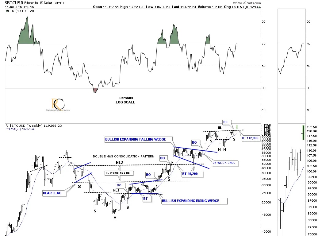
First, let’s look at a few charts we’ve been following very closely and see how they’re progressing. Up first is the daily chart for BTCUSD, which broke out from the blue bull flag right shoulder and then the neckline and is now in backtest mode to the neckline. I saved one position in the Leveraged Trade Portfolio to buy one last position in BITX 2X long BTCUSD on the backtest. If we don’t get a complete backtest, there are other areas in the stock markets I can add the one last trade.
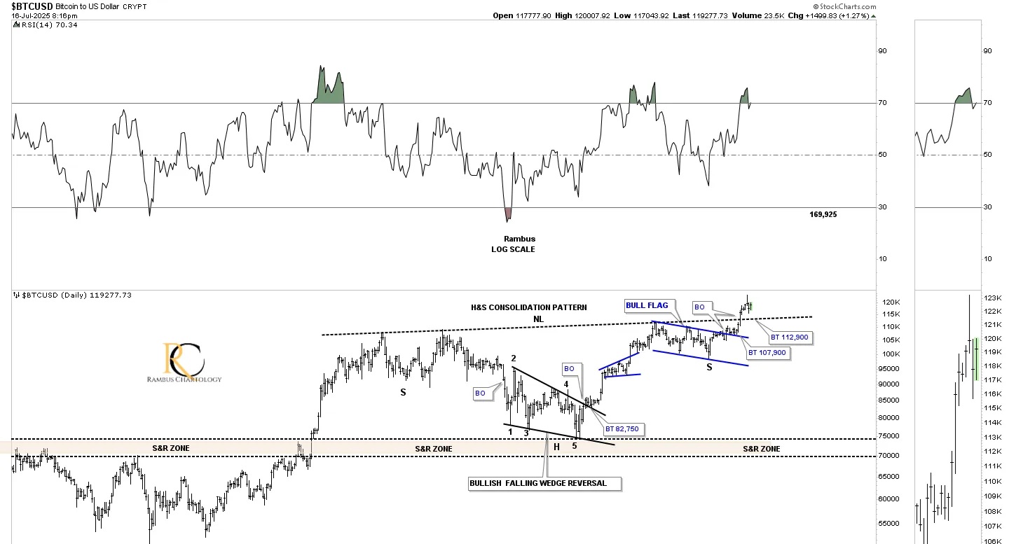
After breaking out from the large 2023 double head and shoulders consolidation pattern, BTCUSD formed the blue bullish expanding falling wedge as the backtest to the neckline, which then led to a new all-time high. During the consolidation phase after a new all-time high was made, BTCUSD formed another H&S consolidation pattern, daily chart above, on top of the blue bullish expanding falling wedge and is now in its second week of the breakout move.
Looking at the price action since the October 2022 low, the head of the double H&S bottom, BTCUSD has formed a classic bull market uptrend with one consolidation pattern forming on top of the previous one.
Rambus Chartology is a reader-supported publication. To receive new posts and support my work, consider becoming a free or paid subscriber.
From this short-term daily chart perspective, the CDNX is still impulsing higher after a slight pause to refresh, forming the small blue flat-top expanding triangle.
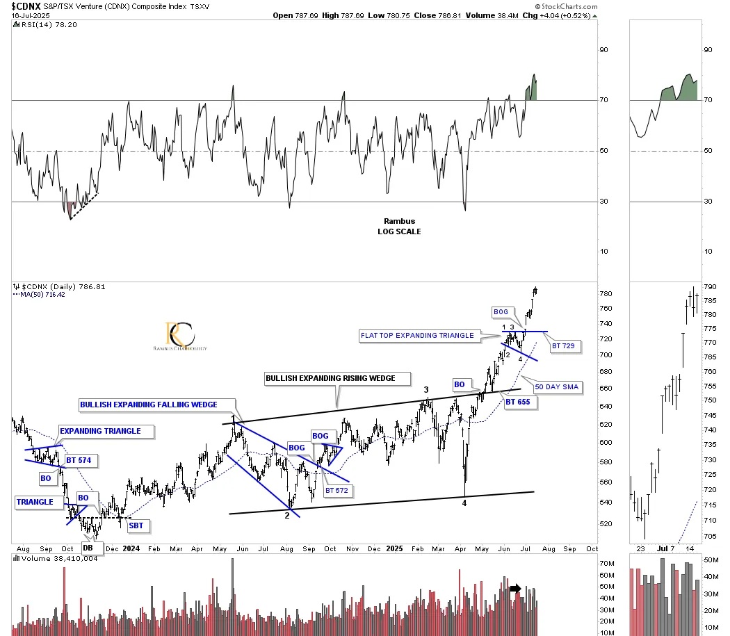
This weekly chart shows the clean version of the double H&S bottom, which is very symmetrical, as shown by the neckline symmetry line, which showed us where to look for a possible low for the right shoulder for both necklines. The reverse symmetry to the upside is still playing out beautifully as shown by the black arrows; how CDNX went down is how it’s going up over the same area.

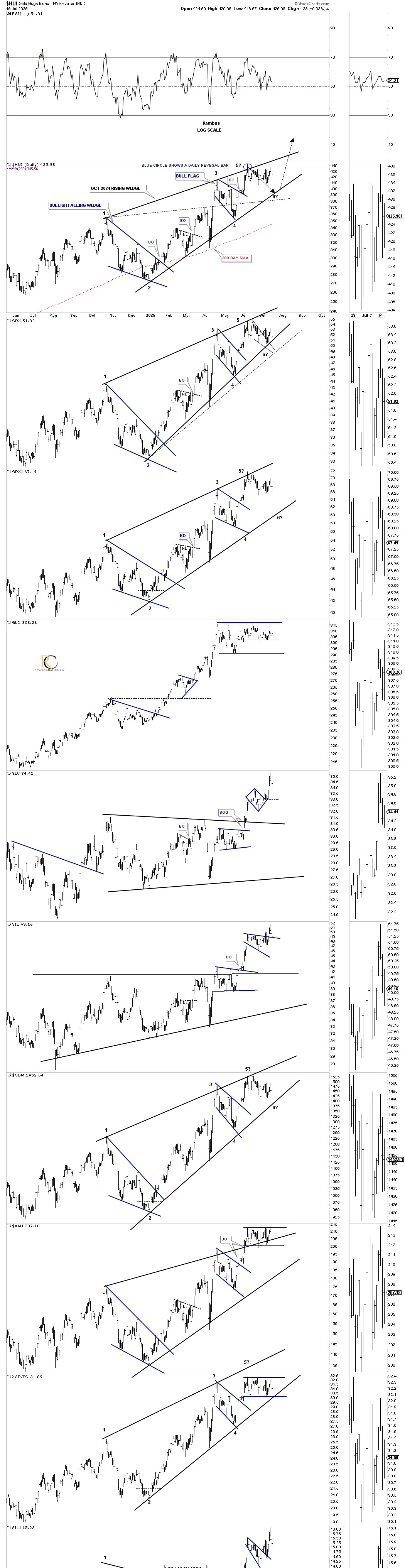
A quick look at the very short-term daily chart for the HUI shows the smaller rising wedge still in play, with a lot of sideways chopping action since the 3rd reversal point with 415 still helping with support.
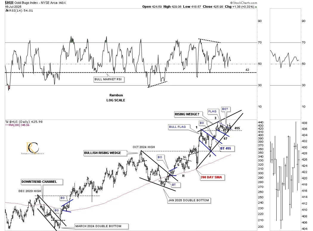
This longer-term daily combo chart shows the much bigger rising wedge that began to form at the October 2024 high and has completed four reversal points in most cases, with a possible 5th and 6th reversal point still a possibility.
GLD is still trading in the center of its current consolidation pattern, while SLV just broke out from its small 6-point diamond consolidation pattern, while the XAU and XGD.TO are forming a possible small rectangle.
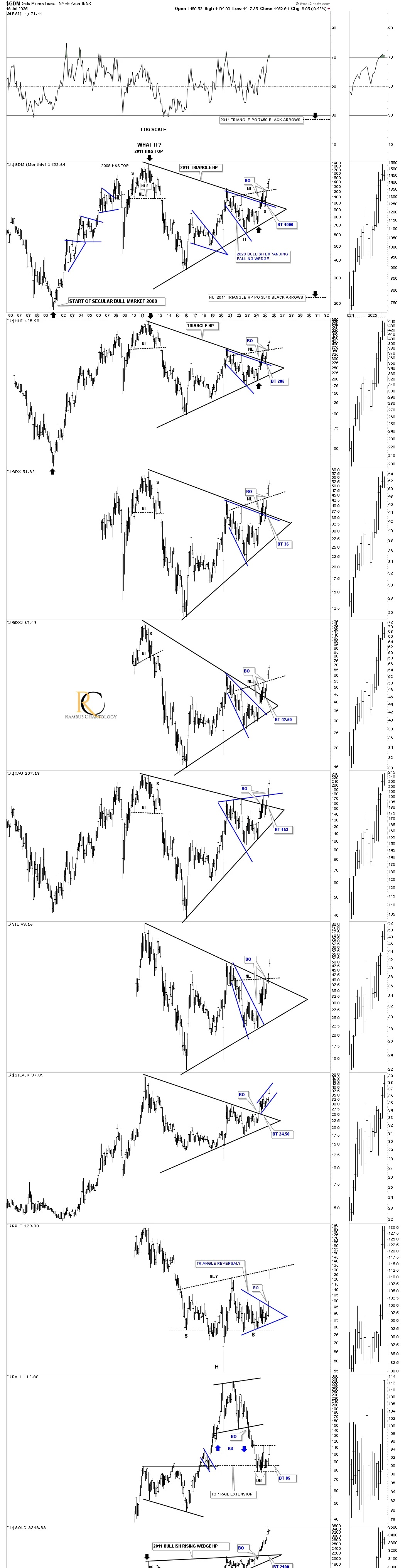
Now, I would like to try and paint you a picture of how big consolidation patterns can lead to an even bigger consolidation pattern that will produce a much larger rally. Keep in mind, chart patterns are fractal. If you see a triangle on a daily chart, for instance, that takes maybe 6 months to a year to form, that impulse move will be relative to the size of that triangle. If you then see another triangle on a longer-term weekly chart that may have taken a couple of years or longer to form, then that impulse move will be relative to that triangle, and so on. There is an internal structure of most trading ranges that goes beyond this post, that makes up those trading ranges. There is a lot more to charting than just drawing a couple of lines on a chart and calling it a pattern.
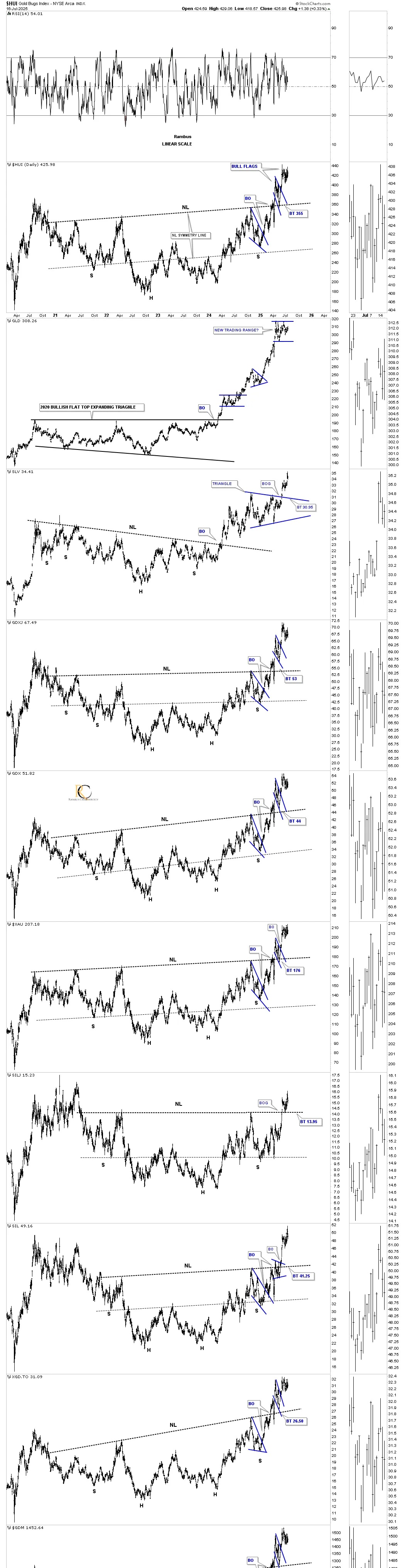
Below is a long-term daily combo chart, which shows the 2023 H&S consolidation pattern in most cases. We finally got the breakout above the neckline earlier this year, with most forming the small blue bull flag as the backtest. Most of these H&S bottoms are pretty symmetrical, as shown by the neckline symmetry line, which gave us an area to look for the right shoulder low. You can also see that many of the H&S are a little unbalanced, with two left shoulders and one right shoulder.
GLD was the only index in the PM complex that didn’t form a H&S consolidation, as it formed the 2020 bullish flat-top expanding triangle, which has led to its current impulse move. Gold is now pausing to refresh, forming another small blue consolidation pattern, gaining energy for the next move higher.
Note that, as GLD has been trading sideways since its April high, the rest of the PM complex has made a slightly higher high, outperforming gold on a short-term basis. It looks like SLV has taken the baton from GLD and is now moving higher on a relative basis, after breaking out from its October 2024 triangle consolidation pattern.
There is another large consolidation pattern that formed after the 2020 high, which is the blue bullish expanding falling wedge, one of the most bullish chart patterns in Chartology. Let’s focus on that large bullish expanding falling wedge on this long-term monthly chart below.
The reason the bullish expanding falling wedge is such a very powerful chart pattern is because of its psychological makeup. During the last reversal point to the downside, the move is generally pretty severe, washing out all the sell stops before the price action reverses quickly, leaving all the sold-out bulls to lick their wounds as the price action reverses on them.
The breakout above the top rail of the 2020 bullish expanding falling wedge came last fall, with the backtest completing in January of this year. Since the completion of the backtest, the price action has been impulsing higher, leaving no doubt about the bullishness of the bullish expanding falling wedge.
Not every 2020 trading range created a bullish expanding falling wedge; the XAU formed a larger expanding triangle as its consolidation pattern. Toward the bottom of this combo chart, PPLT formed a very symmetrical triangle consolidation pattern with a massive breakout move just recently and may be in the process of forming an even larger H&S inverse H&S bottom. Note how the price action hit the potential neckline last month and backed off, telling us the neckline is hot and to be respected. PALL has reached the top of its sideways trading range, gearing up for its breakout move higher.
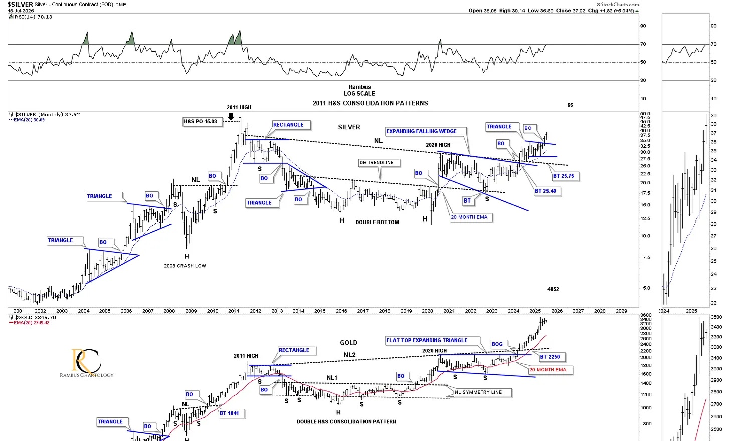
I would like you to focus on SLV, which has created a very bullish combo consolidation pattern, made up of the 2023 H&S consolidation pattern that we looked at above on the daily combo chart showing the H&S consolidation patterns, and the 2020 blue bullish expanding falling wedge. That precise combo consolidation pattern is the exact same consolidation pattern that gold formed at its 2008 crash low, which then led to the large impulse move to the 2011 all-time high back then before the bear market began.
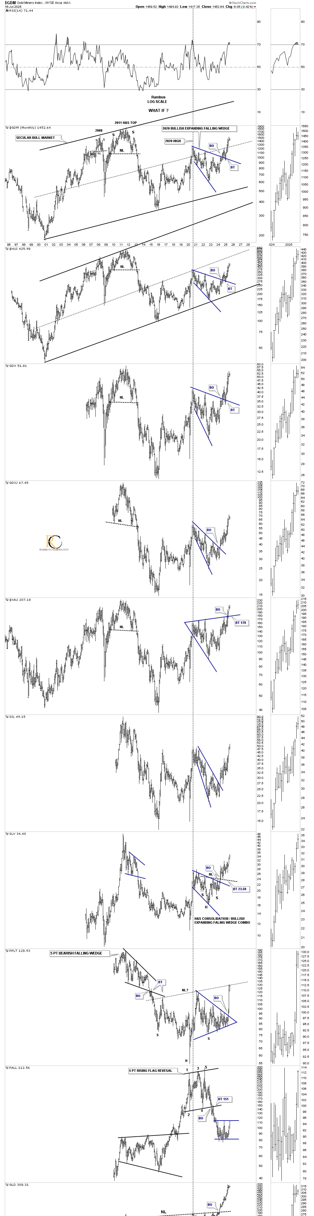
So far, we’ve looked at the nearly four-year H&S consolidation pattern, as shown on the daily combo chart above, and the 2020 blue bullish expanding falling wedge. This next monthly combo chart combines the 2023 H&S consolidation pattern and the 2020 blue bullish expanding falling wedge into one consolidation pattern, which is a very powerful setup.
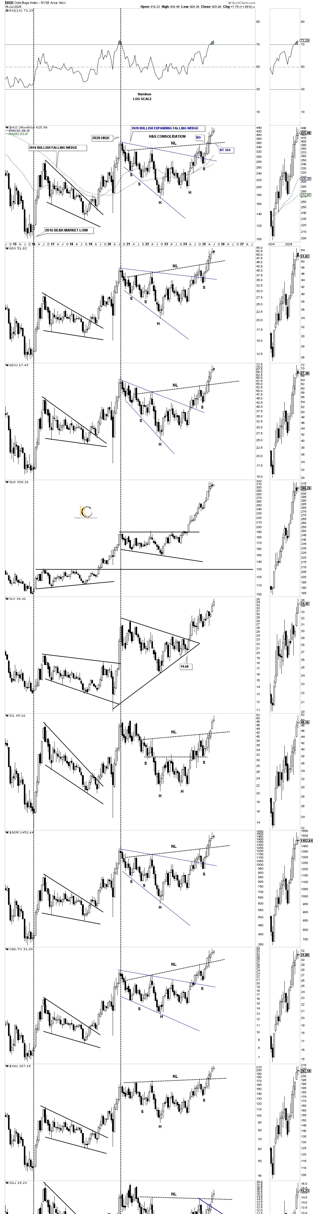
We can now add another large consolidation pattern to the mix, which is the 2016 bullish falling wedge that was the first consolidation pattern to have formed after the 2016 bear market low. These are the three large consolidation patterns that the PM complex has formed since the bear market low, and when we combine all three, we get an even bigger consolidation pattern, which we’ll look at next.
In the first paragraph of this Wednesday Report, I wrote:
There is an old expression in Chartology that says, “BIG CHART PATTERNS LEAD TO BIG MOVE.” There is another expression that I came up with that says, “BIG CHART PATTERNS CAN LEAD TO EVEN BIGGER PATTERNS AND BIGGER MOVES.”
Putting all the pieces of the puzzle together, this next long-term monthly chart shows the 2011 symmetrical triangle consolidation pattern, which I’m also calling a halfway pattern, as shown by the black arrows on the HUI. In any consolidation pattern, you need to have an even number of reversal points – 4, 6, 8, or more. The 2011 H&S top would be reversal point #1, with the 2016 low being reversal point #2, reversal point #3 would be the 2020 high, and reversal point #4 would be the 2022 low.
You can now see how the 2023 H&S consolidation pattern and the 2020 blue bullish expanding falling wedge fit into the apex of the 2011 triangle. Note how the price action broke out of the blue 2020 bullish expanding falling wedge, which is also the top rail of the 2011 triangle, with a completed backtest before taking out the neckline of the 2023 H&S consolidation pattern. That backtest to the top rail of the blue 2020 bullish expanding falling wedge and the top rail of the 2011 triangle ended up forming the right shoulder low of the 2023 H&S consolidation pattern, beautiful Chartology.
At this point in time, the only thing I can’t say with 100% confidence is whether we’ll see a backtest to the neckline before the really big impulse move to the upside gets underway. If we don’t see a backtest to the neckline, then the impulse move to the upside is already in progress. We’ll get our answer from the shorter-term daily charts.
To understand the potential bullishness of this 2011 triangle, just look at the bottom of this combo chart where gold completed its 2011 bullish rising wedge and has been impulsing higher, leading the PM complex.
This next chart is a monthly history chart for the HUI, which we’ve been following for many years, showing its secular bull market parallel uptrend channel and all the trading ranges it has created during its existence. What is interesting is how similar the 2011 H&S top and the 2023 H&S bottom look in time and price. Are we about to see an inverse move to the upside similar to the breakout from the 2011 H&S top?
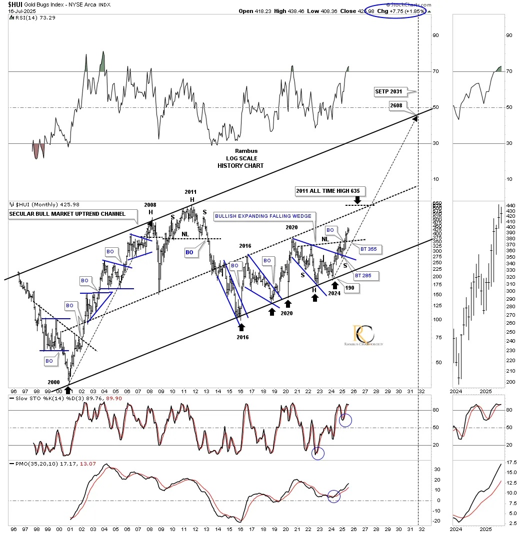
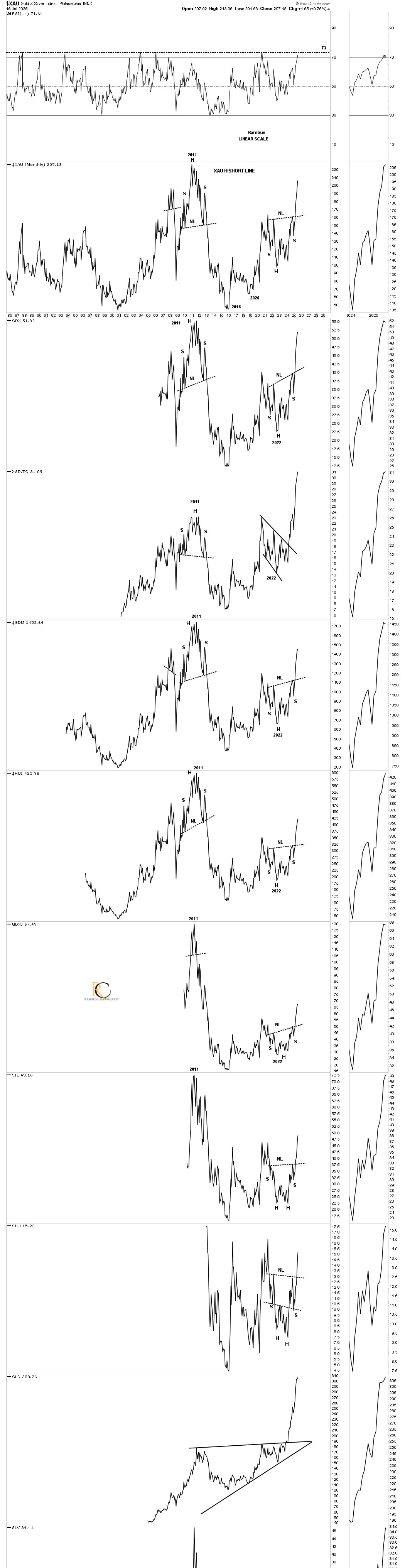
Below is a monthly line chart in linear scale, which shows the 2011 H&S top and the recent 2023 H&S consolidation pattern and how similar they look and the impulse move that followed the breakout of the H&S necklines.
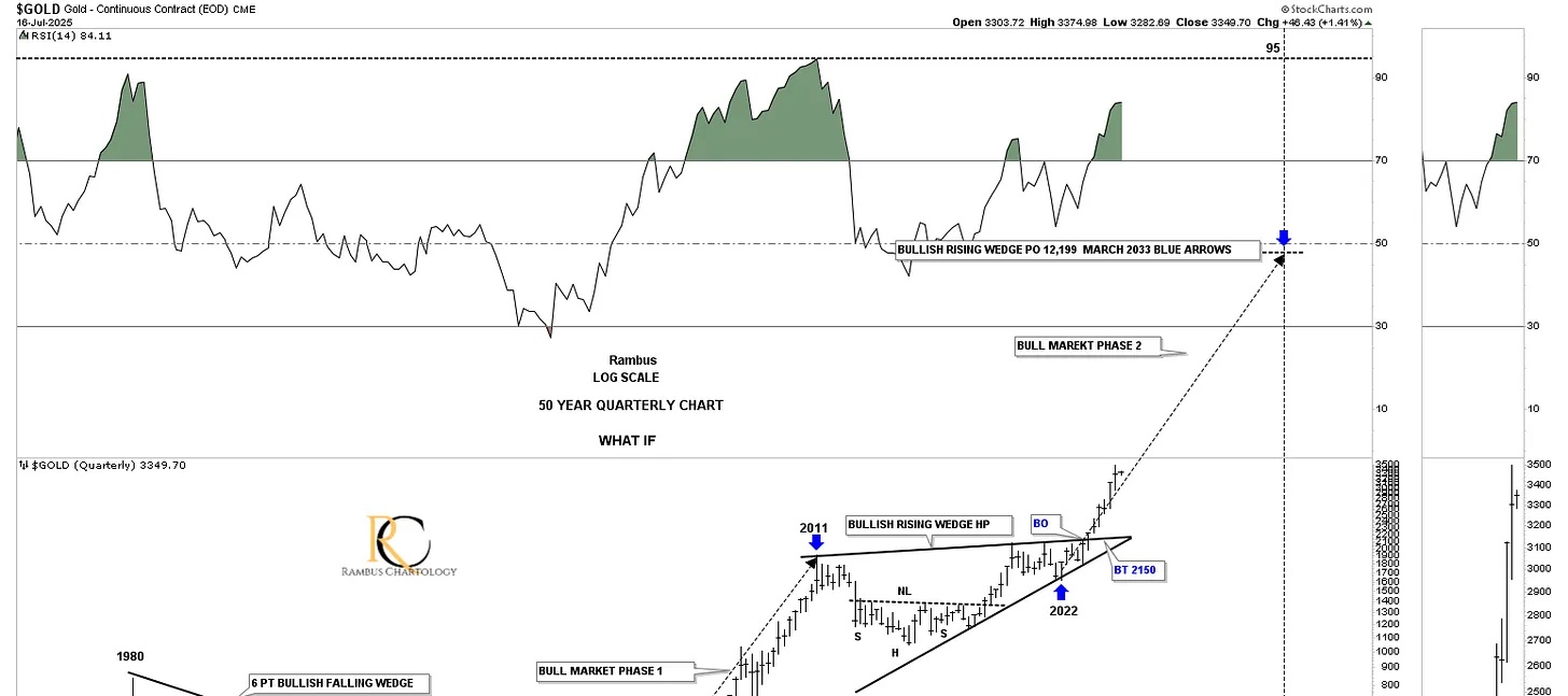
Next is a long-term quarterly chart for gold going back to its 1980 high, which shows the 20-year bear market that followed. During those bear market years, gold formed a massive 20-year bullish falling wedge. At this point, I always add, how do we know it was a 20-year bullish falling wedge? The answer is easy – just look at the bull market that followed the breakout.
Since the 2011 high, gold formed its 2011 bullish rising wedge, which I’m calling a halfway pattern to the upside. Since the last reversal point in the 2011 bullish rising wedge, the angle of the bull market is the same as the 2000 to 2011 bull market rally, long black arrows. Keep in mind, we’ve been following the breakout move while the price action was still trading inside of the 2011 bullish rising wedge, so again, the Chartology is playing out beautifully.
Just a quick update on the short term daily chart for silver showing the baby diamond breakout.
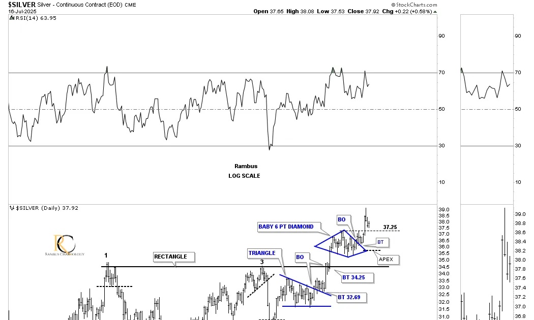
The larger black diamond with the baby blue diamond trading above it.
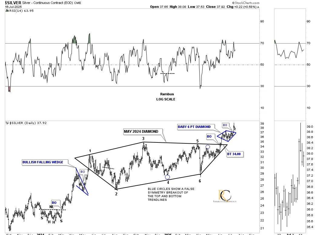
Both silver and gold have also formed a 2011 massive H&S consolidation pattern, which we’ve been following since the right shoulder low. After lagging gold, silver is picking up the pace and is now leading on a short-term relative basis, as it just made a new higher high, while gold is still in its sideways trading range.
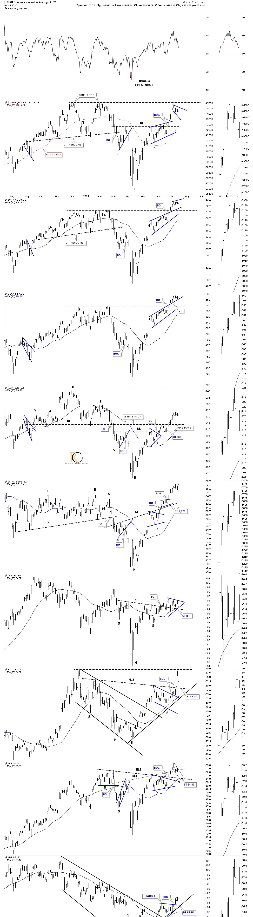
This last chart for tonight is just a quick update on the US stock markets. After breaking out from their H&S bottom in most cases and forming a bullish rising wedge in other cases, the price action has been consolidating over the last several weeks, with a possible new small consolidation pattern forming, which is putting in the possible 4th reversal point low.
So, do big chart patterns lead to big moves, and do big chart patterns lead to even bigger chart patterns, which lead to an even bigger move? Stay tuned, and all the best… Rambus.
*********
share
share
share
share
share
 Meet Rambus, a seasoned trader and technical analyst renowned for his unbiased and insightful chart work. Through his website, Rambus Chartology, and Substack newsletter, Rambus shares his expertise with a global community of subscribers, providing daily updates, commentaries, and hands-on training in the art and science of chartology. With his calm, humble, and down-to-earth approach, Rambus demystifies complex market trends, helping his followers navigate the challenges of today's volatile markets. Join the Rambus Chartology community today and discover a unique blend of technical analysis, trading expertise, and time-tested protocols. Subscribe now at www.rambus1.com or https://rambuschartology.substack.com/