WTF is Going On? Are You Joking? OMG!!!


This week, the Dow Jones made two new all-time highs (BEV Zeros) in its BEV chart below; on Thursday and Friday, its 60th and 61st since it entered scoring position (Red Rectangle below) in November 2023. Well, stuff like that happens during an almost two-year long bull market advance. Also, since the end of June, the Dow Jones has been hugging its BEV 0% line, shunning scoring position’s lower limit at the BEV -5% line.
So, am I warming up to the Dow Jones, seeing the wisdom of buying something in the broad stock market? Absolutely not! The higher the Dow Jones goes, the more new all-time highs seen in its BEV chart below, the more I’m repulsed by the very idea of buying something trading at the NYSE or NASDAQ, unless it’s a gold or silver miner.
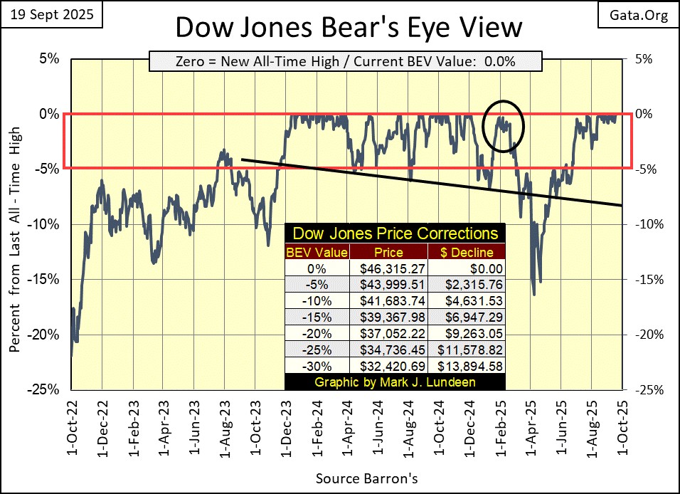
Sorry, I can’t help myself, because I believe we are near a market top. And market tops, while they are compelling times, where investors buy with confidence and never lose any sleep when doing so, they give me the heebie jeebies. By simple definition, market tops are at the top of a market, the place where the opportunity to make a profit approach zero, while risks to invested funds approach maximum.
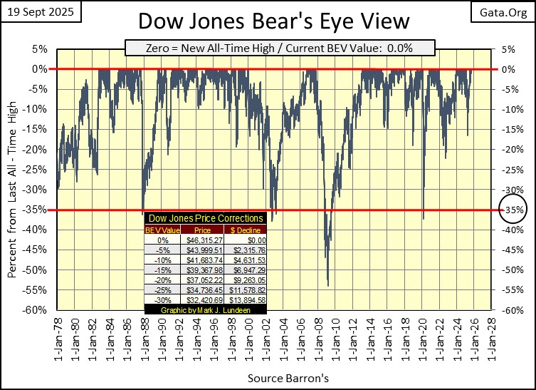
The Dow Jones BEV chart above looks very good. But I’m keeping in mind the BEV chart for the Dow Jones below. This advance in the Dow Jones began in August 1982, forty-three years ago. It’s seen four corrections of over 35% from an all-time high, with a 54% correction in March 2009, that happened to be the second deepest percentage decline for the Dow Jones since 1885, exceeded only by the 89% decline seen during the Great Depression.
What in the hell are we looking at here? Five decades of monetary inflation flowing into the stock market.
To better display that, let’s look at the frequency table below for the BEV data plotted above. This is a very nice feature for looking at a market using the Bear’s Eye View, to easily see exactly how many new all-time highs (BEV 0.0%), closings in scoring position (BEV -0.001%), and specifics for market declines in percentage terms.
Since January 1980, the Dow Jones has seen 884 new all-time highs, or 7.67% of all daily closings were at an all-time high. Since January 1980, the Dow Jones closed in scoring position for 4,737 days, or 41.11% of all daily closings less than 5% from an all-time high. Wow!
As bull market advances in a BEV chart can be identified by looking at areas where the market rises into scoring position, above its BEV -5% line, and remaining there for a period of time. By simply adding the percentage of daily closings found in the 0.0% and -0.001% rows below, we see the Dow Jones was advancing in a bull market for 48.78% of its daily closings since 1980. Or, for 5,621 of its 11,524 days analyzed in the frequency table below, that took the Dow Jones from below 800 in August 1982, to over 46,000 just this week.
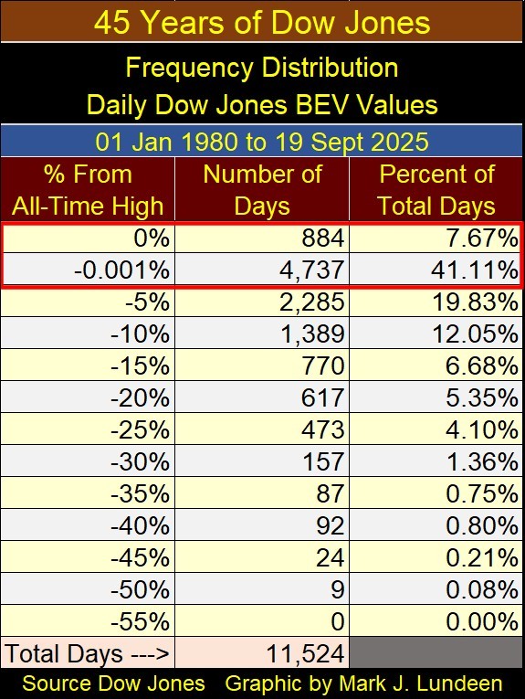
I understand I don’t see the market as most people do. And I understand the Dow Jones in the years to come may actually increase to levels not believable to us today. But I don’t care, as looking at the BEV data in the frequency table above, makes my ganglia begin to twitch. That can’t be good.
Dow Jones at 60,000? I’m the last to say that isn’t possible, as anything is possible when we have a bunch of idiots dictating “monetary policy” at the FOMC. But 60,000 for the Dow Jones is an advance of only 30% from todays close, as opposed to what kind of big bear market percentage decline? Something to compete with the 89% market decline seen during the Great Depression?
Here is the Dow Jones in daily bars. What can I say, it looks good. I expect I’ll be forced to increase this chart’s scaling to 47,500 next week to contain the Dow Jones’ advance within this chart.
I have the emotional wherewithal to deal with that. But I’m not sure if I will, if I have to increase the scaling below to something above 50,000. The Dow Jones at Fifty thousand? There is something about that, that sounds so wrong!
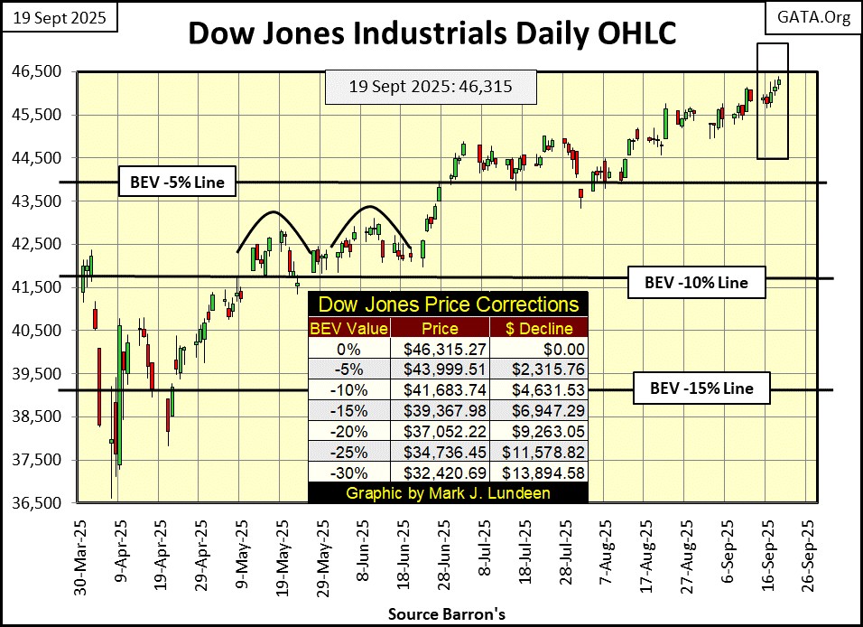
But what I think, and what the market does, can be two completely different things, as seen in the table below listing the BEV values for the major market indexes I follow. While I’m thinking of a repeat of the Great Depression market decline, the market is delivering a bounty of new all-time highs, as seen below. Friday closed with eleven of these indexes closing with BEV Zeros, and all but the last three in the table closing well within scoring position. It’s enough to make a bull moo for joy.
So, why doesn’t the NASDAQ Banking Index (#21) join in the drunken bacchanal on full display below? Yes, why not? Its last all-time high was in November 2021, and this week closed 15.12% below that.
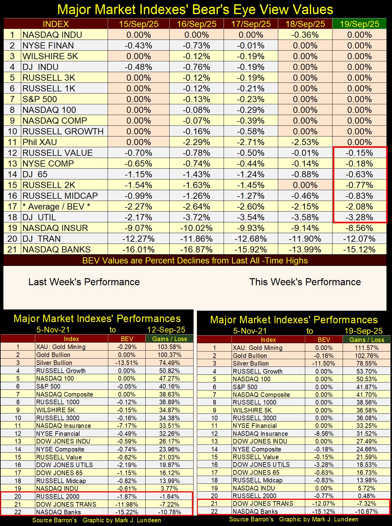
Looking at this week’s performance table above, precious metal assets remain in the top three spots, advancing far above the other major market indexes. Note #1, the XAU, advanced 7.99% from last week. Nothing else came close to the gains the gold and silver miners saw this week. However, there is always next week. But with the advances in the XAU since November 2021, more than twice of any other stock index I follow, no index currently seen from #4 to #21 will exceed the gains of the XAU anytime soon.
Below is a graphic displaying the XAU in the dollars it is published in, along with it in BEV format. I love seeing anything in the market I’m bullish on, soaring upwards as the XAU is doing now. But no market only goes up; sometimes it also goes down.
I’m looking at the spiking XAU below, and I can’t help thinking the next big thing for the gold and silver miners is a stiff correction to the downside. * BUT *, should that not happen, what would that mean? I’m no “market expert,” but an XAU that continues soaring upward into the heavens, may possibly be a harbinger of bad things to come for the broad stock market.
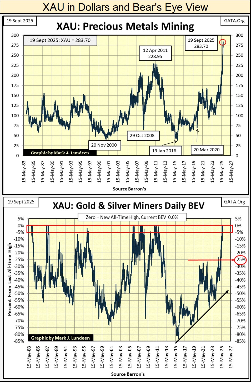
Looking at the XAU in its BEV chart above, coming off of its January 2016, 83% bear market bottom, an extremely hard bottom that purged managed money and retail investment demand from any interest in owning gold and silver mining, I’m thinking there is zero fluff currently in the XAU.
Meaning, there are no nervous Nellies currently owning the gold and silver miners. These people currently buying, and owning these miners are the “hard hands” that always own stocks early in a bull market advance. That isn’t saying they won’t at some point sell these shares. They will, but they will do so only at much higher prices. And for good reason, as once again the idiots at the FOMC are on the march.
It had to happen; the idiots at the FOMC are once again cutting interest rates. Read all about it at CNBC.Com below.
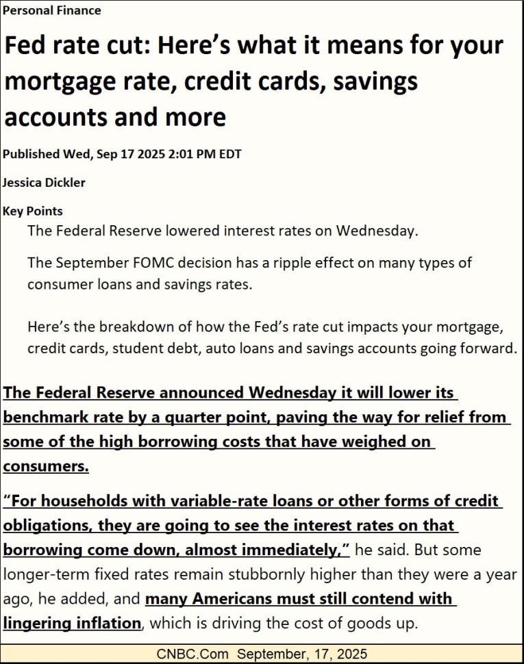
I’ll admit it, it was Trump who forced the idiots to do this, but that doesn’t make this a good idea. So, why do it? It’s the same sorry tale of finance I’ve seen since the 1970s, the pseudo choice between;
- growth – lowering interest rates to increase economic activity by lowering borrowing costs,
- fighting inflation – raising rates to offset the inflationary consequences of previously lowering interest rates.
So, why does lowering interest rates result in “growth?” Interest rates are the cost of money. Like anything else, when something lots of people want becomes cheaper, demand for that something goes up. The FOMC can “fix rates” at this, or that interest rate, because using their tool of monetary inflation, they can and do issue new dollars-of-inflation to banks, at the fixed rate they set.
With money becoming cheaper (lower interests rates), people and business begin doing things, frequently stupid things they wouldn’t do when money cost more. Why stupid? Because these inflationary dollars are too often used in ways that offer no profitable way of servicing the increased debt burden taken on. For consumers, that maybe a once in a lifetime vacation, or larger home they really don’t need. For corporations, taking on additional debt to fund their share buyback and dividend programs.
When it comes to debt creation, no longer limited by the old $35 gold peg, since 1971 the ability for the Federal Reserve System to create debt is unlimited. There is nothing preventing the idiots at the FOMC from writing a check for a million, or a billion dollars to every American. The limiting factor in expanding the money supply by that large factor is; can Americans service the monthly payments for a trillion-dollar loan, the Federal Reserve System could easily create for them?
It’s doubtful that most wage earners at McDonalds could service a ten-thousand-dollar loan from the Fed. But the financial system, with their access to the flows of inflation from the Federal Reserve System, could always extend “additional credit facilities” to these McDonalds employees every month, to assist them in servicing their billion-dollar debts from the Federal Reserve System.
If the financial system already does that for today’s zombie corporations, corporations whose business operations are insufficient to service their debts, and there are lots of them out there, why not to McDonalds’ employees? Digital dollars; what is there to not like about them?
For the record, I’m not advocating the Federal Reserve extend billions and trillions in credit to wage earners. The American economy would soon cease to operate following the consequences of having that done. I’m only illustrating the fact that if today, governments, corporations and individuals are up to their eyeballs in debt, and no one today is saving dollars to provide for their future, it is because the Federal Reserve System has totally trashed the dollar, as it burdens anything economic with as much debt as it can reasonably service – and then some.
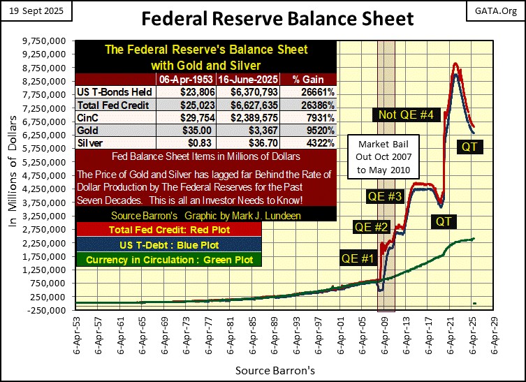
Next is a chart for the balance sheet for the Federal Reserve. You’ll never see this chart in the mainstream media, or in a college text book for economics, as it is an embarrassment. On the eve of the sub-prime mortgage crisis (2007), the Fed’s balance sheet was under a trillion dollars. By January 2023, following the bailout the financial systems’ debacle in mortgages, and then the March 2020 Flash Crash, the idiots at the FOMC had to “monetized” an additional seven-trillion dollars in debt.
Note the bank bailout for the sub-prime mortgage debacle (QE 1-3) was less than the bailout for the March 2020 Flash Crash (Not QE#4). The idiots aren’t stupid. Learning from the sub-prime mortgage crisis to nip a banking crisis before it has time to metastasize, they flooded the financial system with over $2.27 trillion dollars, from March to June 2020 with their Not QE#4.
If they hadn’t, what would have happened? But more importantly, how many dollars-of-inflation will have to be “injected” into the financial system to “stabilize” it when the next financial crisis arrives?
Since January 2023, the Fed’s balance sheet is down some two trillion dollars, or so they would have us believe. Do I believe that? I believe the smartest people in the world, for the most part now control its financial system, and these selfish people have totally trashed the world for the rest of us.
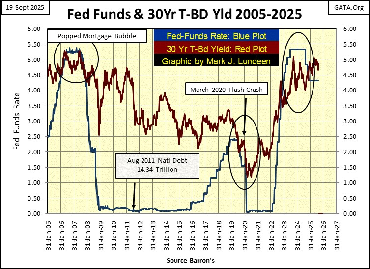
Here is a chart plotting the FOMC’s Fed Funds Rate, and the yield for the US Treasury’s 30Yr Bond, going back twenty years. In my younger days, I remember watching for yield curve inversions, when the Fed Funds Rate increased to something over the yield for the 30Yr T-bond, predicting something bad was going to happen in the stock market.
Something bad like the crash in the sub-prime mortgage bubble in 2007, or providing the triggering event for the March 2020 Flash Crash. But, all during 2023-24, we saw a massive inversion in the yield curve below, and what happened from that?
The only negative event I’ve noted, was that for years smucks like me, trusting the old rules still applied, were predicting bad things to happen in the financial system that somehow never happen, and I hate that when it happens!
Well, I think we can all agree I’m the victim here. But that is okay, as when I finish writing, I’ll go upstairs and console myself with a cigar and a generous glass of bourbon. So, calm down Mark, as soon all will be well.
Until then, let’s look at this chart a bit longer. Let’s see what FOMC Idiot Primate, Doctor Ben Bernanke did to all of us with his “monetary policy” of “zero interest rates” from 2008 to 2016. Eight years of free money for the banking system that encouraged them to do some incredibly stupid things. And what stupid things would those things be?
Heck, I don’t know. I just know human nature. So, when I see the eight years of free money above, with the grotesque expansion of the Federal Reserve’s balance sheet also seen above, provided to the banking system, a banking system managed by the smartest people in the world, with access to super-computers and now “artificial intelligence,” the idiots have provided the banks the means to totally destroy everything they’ve lent money to. I’m figuring some historic trillion-dollar banking blunders are now fully incorporated into the global banking system.
Admittedly, I don’t know what I’m taking about. But I’m being honest. I doubt Jamie Dimond of J.P. Morgan, or anyone else actually knows that much more than I do of what is coming this way for the banks. Before the pending flood, economists and “market experts” would never admit that. But a day is coming when they will pick up a phone, and their reaction will be: WTF is going on? Are you joking? OMG!!! Because the pending tsunami of defaults in the banking system will be as big of a surprise to them, as it will be to anyone else watching CNBC.
Exactly what these historic blunders in banking will prove to be, that no one in the banking industry is currently aware of, I can’t say. So like me, and Mr. Dimond of J.P. Morgan, my readers will just have to wait until Mr Bear once again comes to pay Wall Street a visit, as a big bear market will reveal all.
But today, Mr Bear is nowhere to be seen. However, with Barron’s Best (Red Plot below) and Intermediate Grade Bond Yields (Blue Plot below), we can see Mr Bear’s calling card going back to the depressing 1930s.
A little commentary on this bond market data series is due here. Barron’s has published this weekly series of corporate bond yields since the Great Depression. However, intermediate grade bond yields before 1938 comes from the Dow Jones 40Bond Average, that spans back to 1926. Barron’s incorporated the Dow Jones data, into their intermediate grade bond yields, which is fine with me.
Data published by Barron’s goes back a long way.
Barron’s Intermediate Bond Yields are very sensitive to pending economic problems. When problems arise, unlike Barron’s Best Grade Bonds, the owners of these lessor grade bonds sell in a panic, producing the spikes in yield seen below.
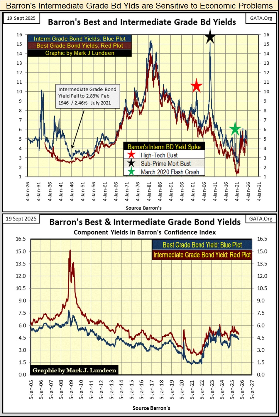
They spiked during the Great Depression, then again as WWII approached. They didn’t see a yield spike again until the NASDAQ High-Tech boom went bust (Red Star). In 2008 (Black Star), the sub-prime mortgage bust saw them spike to yields not seen since the 1982 bottom of the bond bear market.
The March 2020 Flash Crash also saw a yield spike in intermediate grade bonds (Green Star). Not much of a spike, as these spikes can go. However, in March 2020 the Federal Reserve announced that for the first time in their history, they were going to begin purchasing corporate bonds to “stabilize” this market. Had they not, how much higher would these intermediate grade bond yields have spiked in the spring and summer of 2020?
Following 2020, the yields for intermediate grade bonds have behaved themselves. But I keep my eyes focused sharply on this data, waiting for the next spike in intermediate grade bond yields, announcing Mr Bear is once again paying Wall Street a visit.
Let’s move on to gold’s BEV chart. As with the Dow Jones, gold too made two new BEV Zeros this week, on Monday and Tuesday, its 73rd and 74th since it entered into scoring position in November 2023.
What else is there to say about gold in its BEV chart below, except for as long as it remains in scoring position within the Red Rectangle, closing daily above its BEV -5% line, we must assume additional new all-time highs will follow.
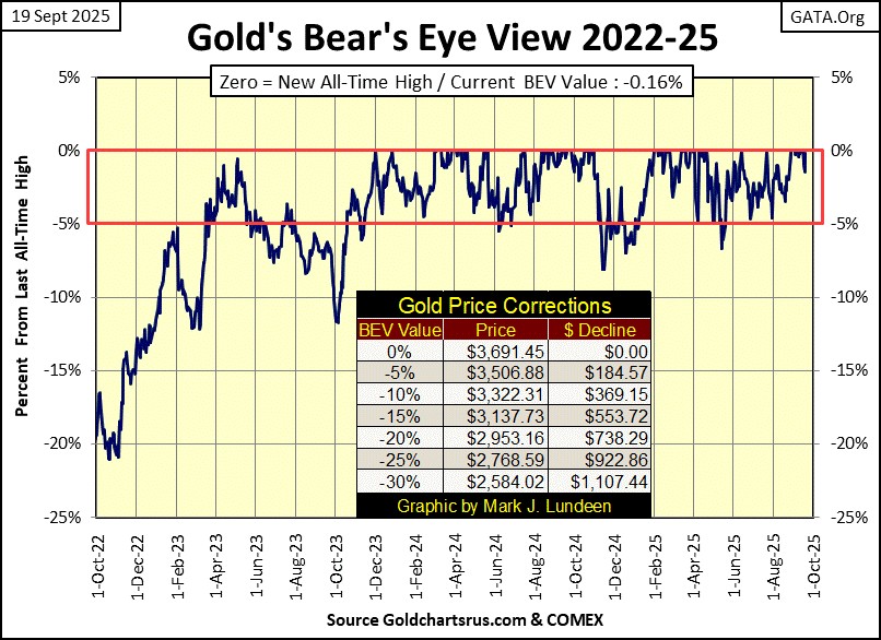
Now on to gold and silver’s indexed value plots. Like the XAU, gold too appears to need a proper correction in the chart below. But what if that doesn’t happen? What if gold’s indexed value plotted below increases to 100 ($4,350) without a correction, say by next March. That is only an 18% advance from this week’s close, but the psychological impact of seeing gold trading over $4,000 should catch the attention of many investors who currently don’t have any.
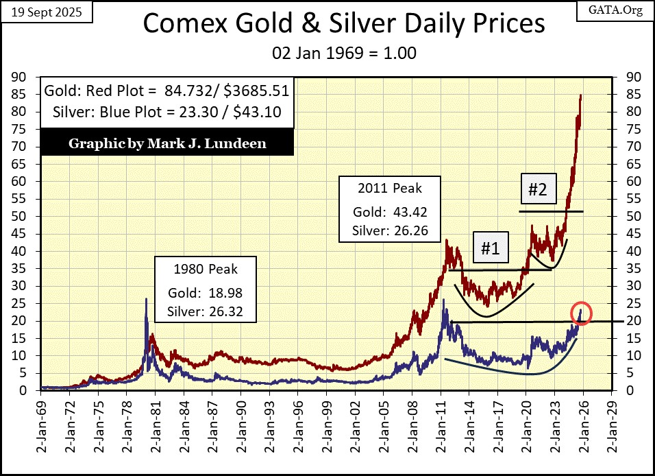
The price of silver is spiking too. But with the above chart’s scaling set at 90, silver with its current factor of only 23.30, doesn’t show it. A quick review of this week’s performance table above, will assure silver investors that silver is doing just fine.
In gold’s step sum table below, its 15-count saw a very overbought +9 on Tuesday’s close this week. Markets don’t like being very overbought, so the market sold off a bit at the end of the week, leaving gold’s 15-count at a neutral +5. It would be healthy seeing some additional down days next week, but that wouldn’t rule out a few more BEV Zeros as gold’s 15-count came down a bit more.
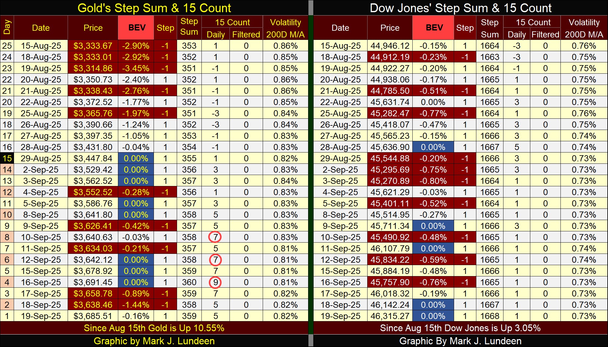
For the Dow Jones in its step sum table, it is the perfect example of what I’d like to see gold do in the weeks ahead. The Dow Jones saw a 15-count of +5 on August 28th. Since then the count has decreased to a +1, as it continued making new all-time highs all the way down.
This is excellent market action that promises additional “growth” in the Dow Jones in the weeks to come. Big bear that I am, I won’t argue with success. And right now, the Dow Jones is heading towards 50,000, whether I like it or not. What could change my opinion on that? See the Dow Jones fall from scoring position, and then keep going down.
Eskay Mining issued a press release this week.
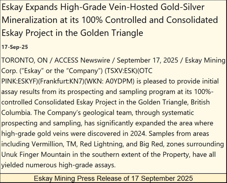
https://eskaymining.com/news/news-releases/eskay-expands-high-grade-vein-hosted-gold-silver-m-11488/
Eskay Mining’s exploration for 2025 is almost complete. No drilling this year, but lots of field work has continued locating additional veins of mineralized ore, some with impressive gold values, as published in the above press release.
And this press release covers only one of the many prospective targets of exploration located on Eskay’s property.
When one sees all of the world class gold and silver mines surrounding Eskay Mining’s property, assuming Eskay Mining’s massive property in British Columbia’s Golden Triangle has a few similar ore bodies is absolutely a reasonable assumption.
Eskay is looking for a major mining company to take a good look at their property, and after doing their due diligence, be willing to pay the company an appropriate price for what they are buying. I don’t know what that price will be, but it will be a whole lot more than the $0.24 a share Eskay Mining closed this week at. I still believe Eskay Mining is one of the most undervalued, and prospective exploration companies in the market.
Mark J. Lundeen


