Big Moves Developing In Strategic Markets…
 share
share
 share
share
 share
share
 share
share
 share
share
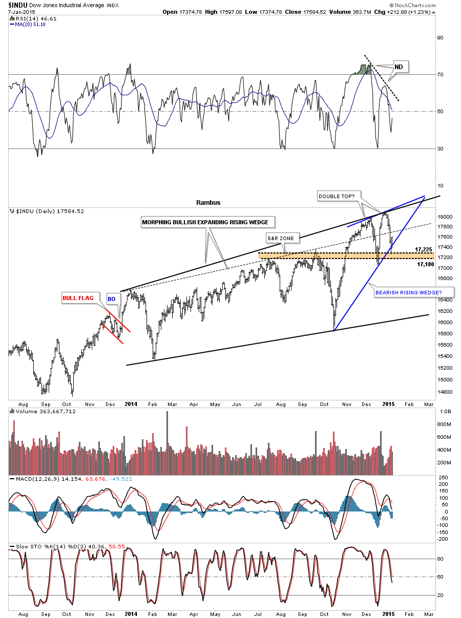
Tonight I would like to touch on several different areas in regards to our trades we have going right now. First lets look at the INDU and some of the reasons I went short yesterday. The daily chart shows a rising wedge in which the price action closed below the bottom rail yesterday. Today’s bounce was a little stronger than what I was hoping for closing above the bottom rail of the falling wedge. There is also another and I believe stronger chart pattern in play and that is a possible double top. As you can see on the rising wedge, reversal point #4 is higher than reversal point #2. When you look at the RSI, at the top of the chart, you can see a big negative divergence. The same holds true with the MACD at the bottom of the chart. The blue histogram is still negative and the slo sto is falling. The 50 dma comes in just above at 17,632 so all these indicators are negative.
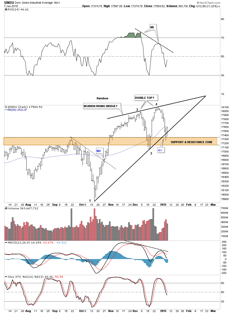
The four horsemen are all negative at this time.
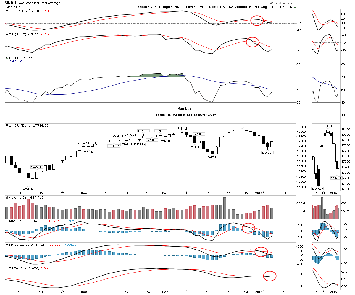
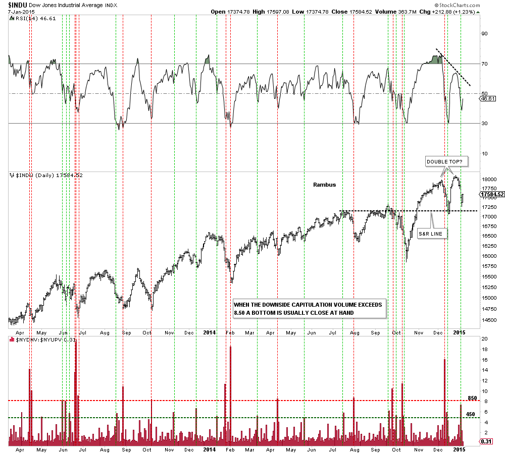
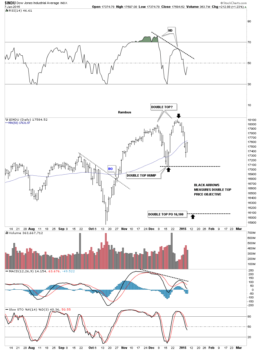
Next I would like to expand on the possible double top scenario and how it may play out if indeed that is what we’re seeing. Below is the down to up volume chart that shows you a clear picture of the possible double top with the negative divergence on the far right hand side of the chart. There is also the black dashed S&R line that is made from the previous tops that has been working as support.
This next chart is a long term daily look that shows the expanding rising wedge we’ve been following that has now had two false breakouts through the top rail. Monday’s decline put the price action below the now dashed original rail and I move the top rail up to connect the December 2013 high and our most recent two highs made in November and December of this year. For the time being I’ve labeled the pattern as a morphing expanding rising wedge until we get more confirmation one way or the other.
If the double top plays out the price objective would be down to the 16,100 area as shown by the black arrows. That is an important number in the big scheme of things which I will show you after this next chart.
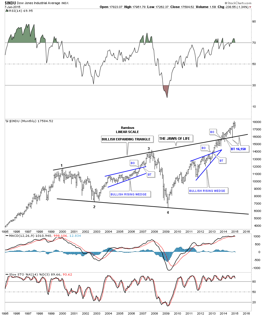
The very long term monthly chart for the INDU shows the expanding triangle that I call the JAWS OF LIFE. If the INDU is putting in a double top and the price objective for that double top is around the 16,100 area then that would be another backtest to the top rail of the expanding triangle which I have at 16,150. So putting all the pieces of the puzzle together I can see another small correction down to the 16,100 to 16,150 area that doesn’t hurt the major uptrend that has been in place since 2009. This is how I’m seeing the setup right now.
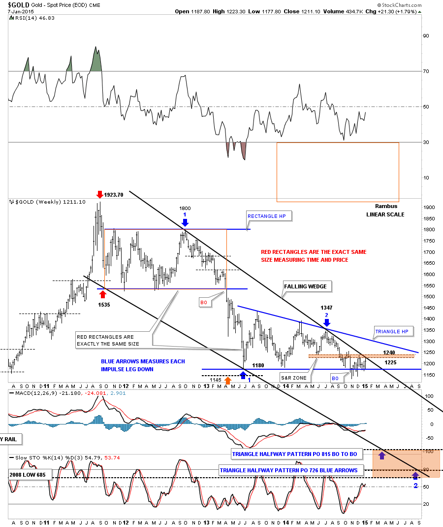
Next let's look at the weekly chart for gold that shows the price action since the bull market high at 1923. I want to focus in on the top black rail of the falling wedge and this weeks price action. Notice the thin brown shaded support and resistance zone that comes in between the 1225 and 1240. As you can see the high this week has been up to 1223 which is touching the top rail of the black falling wedge. So gold is now trading at resistance until proven otherwise.
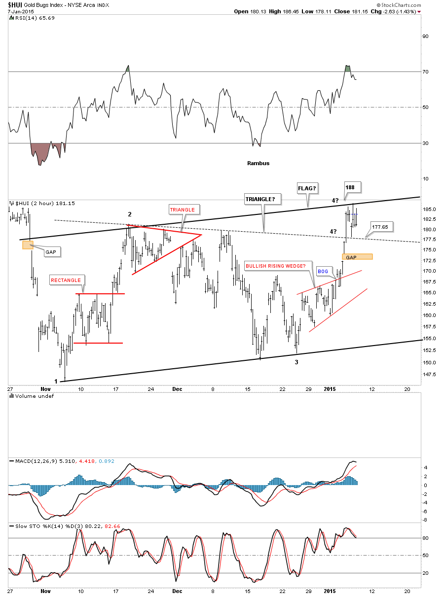
Let's take a quick look at the HUI that has been bouncing between the potential top rail of a bear flag and the top rail of a triangle. What’s important about this area is that we need to see a fourth reversal point to finish up a consolidation pattern. As of today the solid top rail is holding resistance which is critical to begin a move down to at least the bottom of the potential bear flag. The fourth reversal point won’t be complete until the price action touches the bottom rail so there is still a lot of work to do yet with the HUI. As I’ve shown you in the past this area is critical as a halfway spot to the lower price targets.
Let’s put the potential bear flag in perspective and look at another long term daily chart for the HUI. Again the possible red bear flag won’t be complete until the bottom rail is hit.
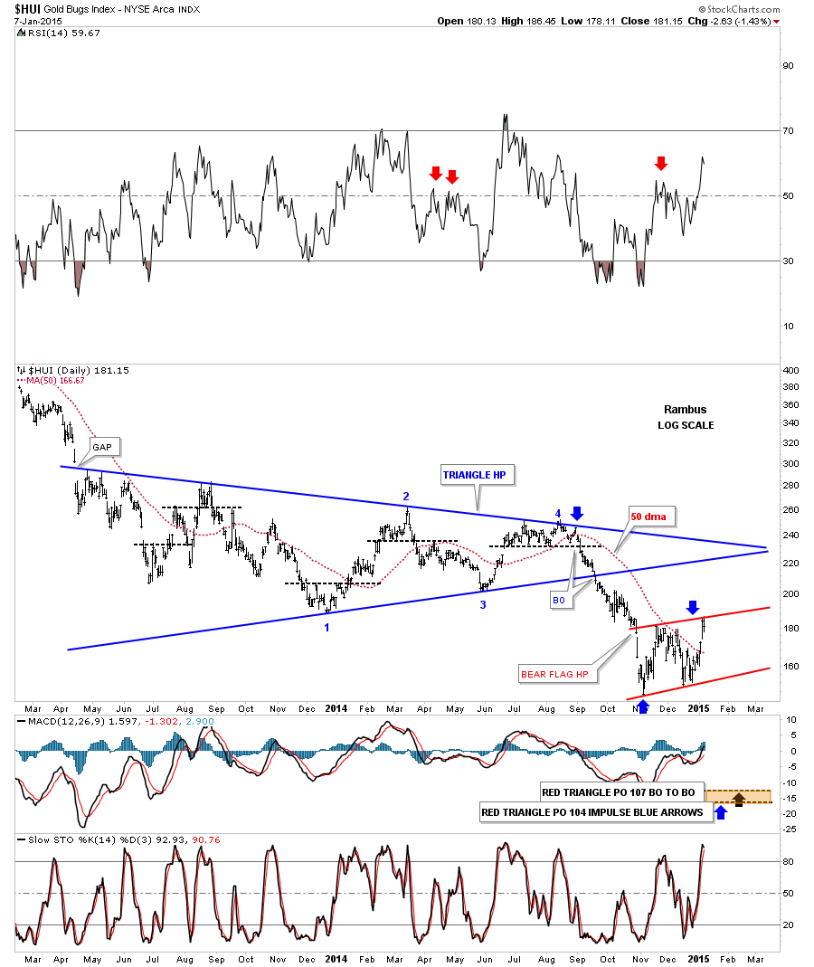
Previously I showed you a possible triangle that was forming in the major downtrend channel in the HUI. I’ve now changed it to the potential red bear flag. Notice how the price action is getting closer to the top solid rail of the downtrend channel. It can get there from trading sideways or by moving higher or a combination of the two. I’m still viewing this pattern as a halfway pattern to the downside. As you can see there is still a large time component left which needs to be fulfilled to reach the bottom price objectives.
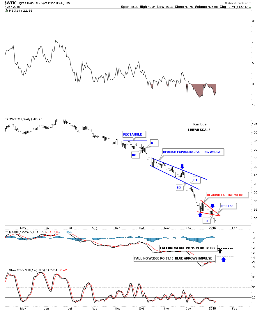
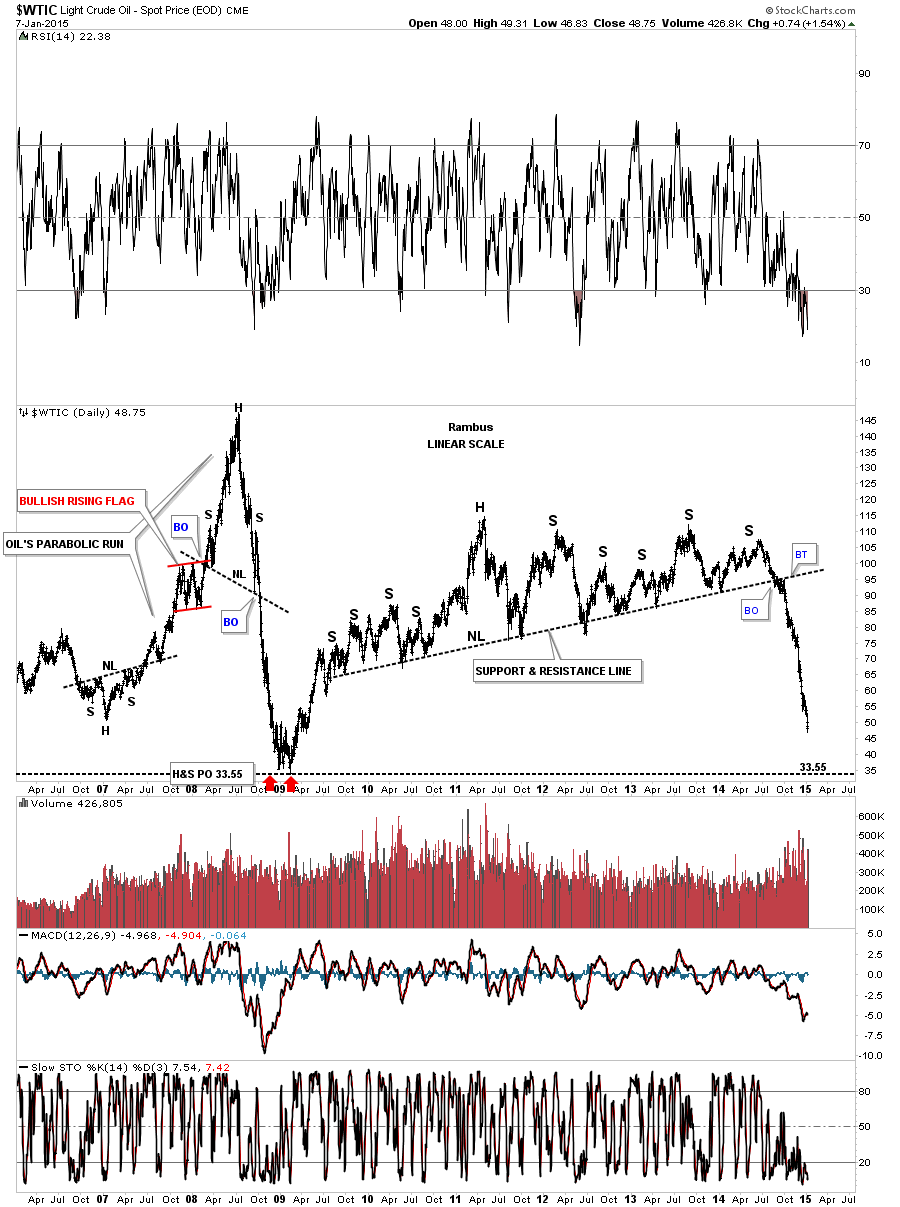
Now let's take a look at the daily oil chart that has been doing pretty good for us so far. Three days ago oil broke out of a small red bearish falling wedge which is the third and possible last consolidation pattern to form in this downtrend. A possible backtest would come in around the 51.50 area. If this little red bearish falling wedge plays out it will give us a price objective down to the 35 area which is the top of the old trading range.
Below is a long term daily chart that shows the massive top that oil broke out from to get this kind of move down. Once that big S&R line broke all the pent up energy was released and this is what we got.
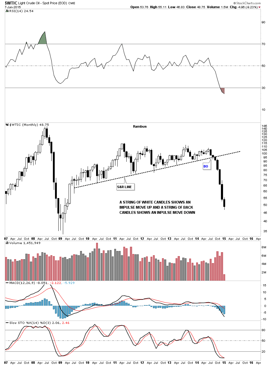
This long term monthly candlestick chart for oil shows it’s now in its seventh month of decline.
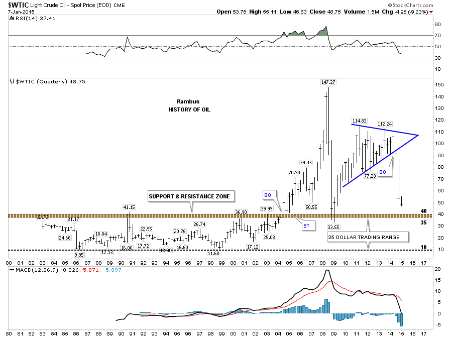
This last chart for oil shows its total history and the the big trading range between 10 and 40 dollars. The brown shaded support and resistance zone, between 35 and 40, is what I’m shooting for.
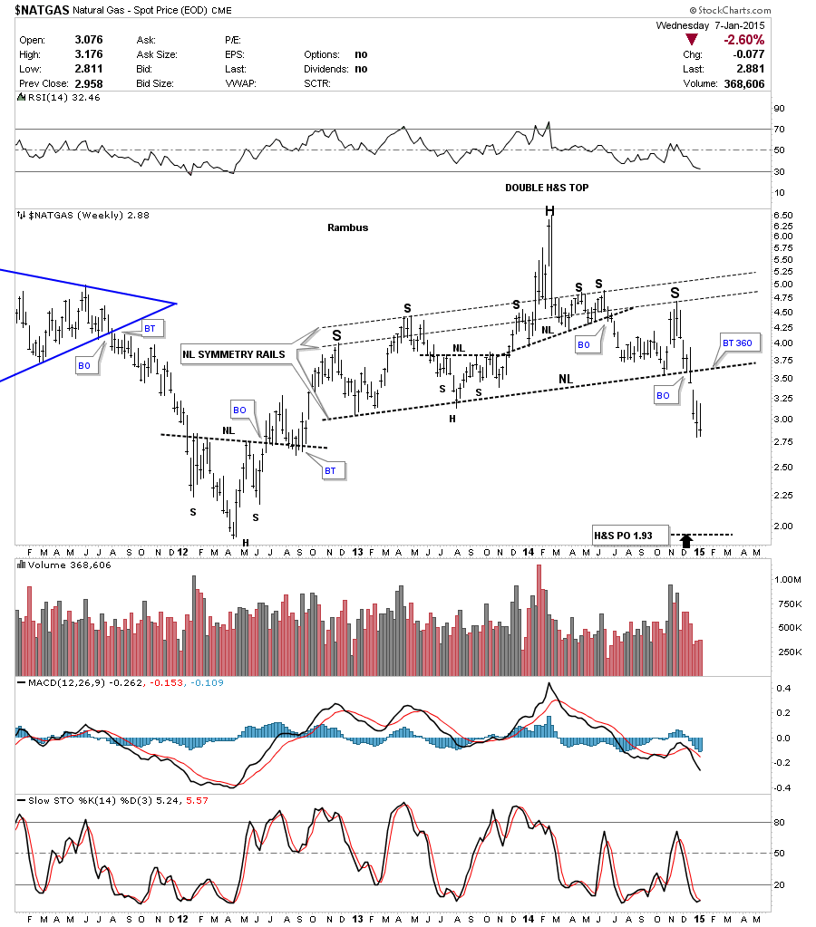
Moving on to natural gas lets look at the daily chart and see what it maybe showing us. After breaking out from the small double top, bouncing off of the S&R line which caused a backtest to the underside of the double top hump, natural gas finally broke out and moved lower. Natural gas has been bouncing around for the last week and a half or so as shown by the red horizontal lines. It maybe trying to build out a small consolidation pattern between 2.81 and 3.15.
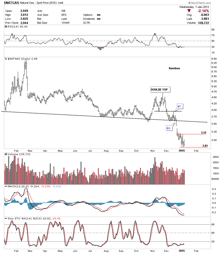
Looking at the weekly chart we can see natural gas has broken down out of a very large and symmetrical H&S top. It took roughly 2 1/2 years to build out that large H&S top so this move down is just getting started on a relative basis. Big pattern big move.
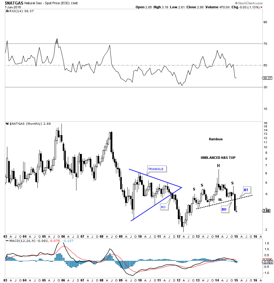
Below is a monthly candlestick chart for natural gas that shows just one black candle so far in this decline. You can also see the H&S top from the chart above.
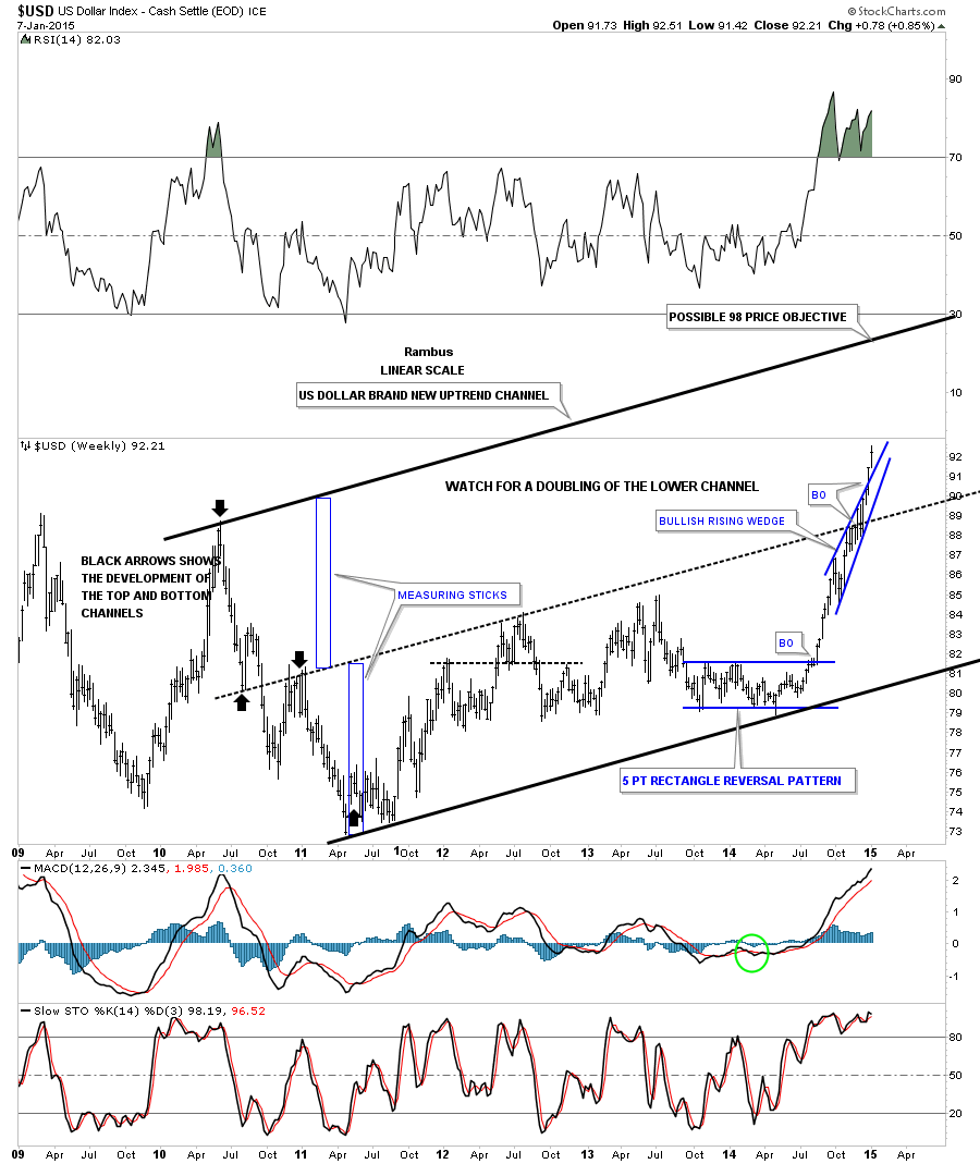
Let's look at one last chart for tonight which is a long term weekly chart for the US dollar. As you can see the blue bullish rising wedge, that has formed in the middle of a possible new uptrend channel, is still plugging along to the upside. If things keep moving up for the US dollar the top rail, of the now possible uptrend channel, would be touched around the 98 area depending on where it gets hit and how soon. Just something to keep an eye on. All the best…Rambus
share
share
share
share
share
 Meet Rambus, a seasoned trader and technical analyst renowned for his unbiased and insightful chart work. Through his website, Rambus Chartology, and Substack newsletter, Rambus shares his expertise with a global community of subscribers, providing daily updates, commentaries, and hands-on training in the art and science of chartology. With his calm, humble, and down-to-earth approach, Rambus demystifies complex market trends, helping his followers navigate the challenges of today's volatile markets. Join the Rambus Chartology community today and discover a unique blend of technical analysis, trading expertise, and time-tested protocols. Subscribe now at www.rambus1.com or https://rambuschartology.substack.com/