Building for the Next Surge: Consolidation Pattern Analysis


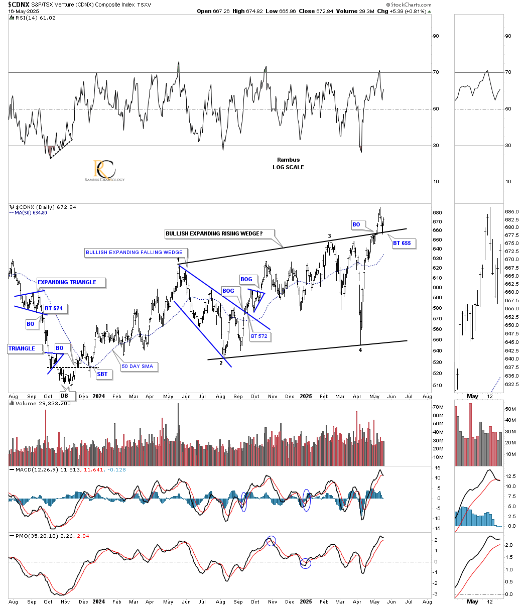
In the Wednesday Report we looked at a few charts which were showing a possible short term low that could be forming. There still needs to be a little more confirmation, but so far the possible short term low is still holding. We’ll know this coming week if the low is going to play out.
The short term low on the backtest to the top rail of the one year bullish expanding rising wedge held support on Thursday on the daily chart for the CNDX.
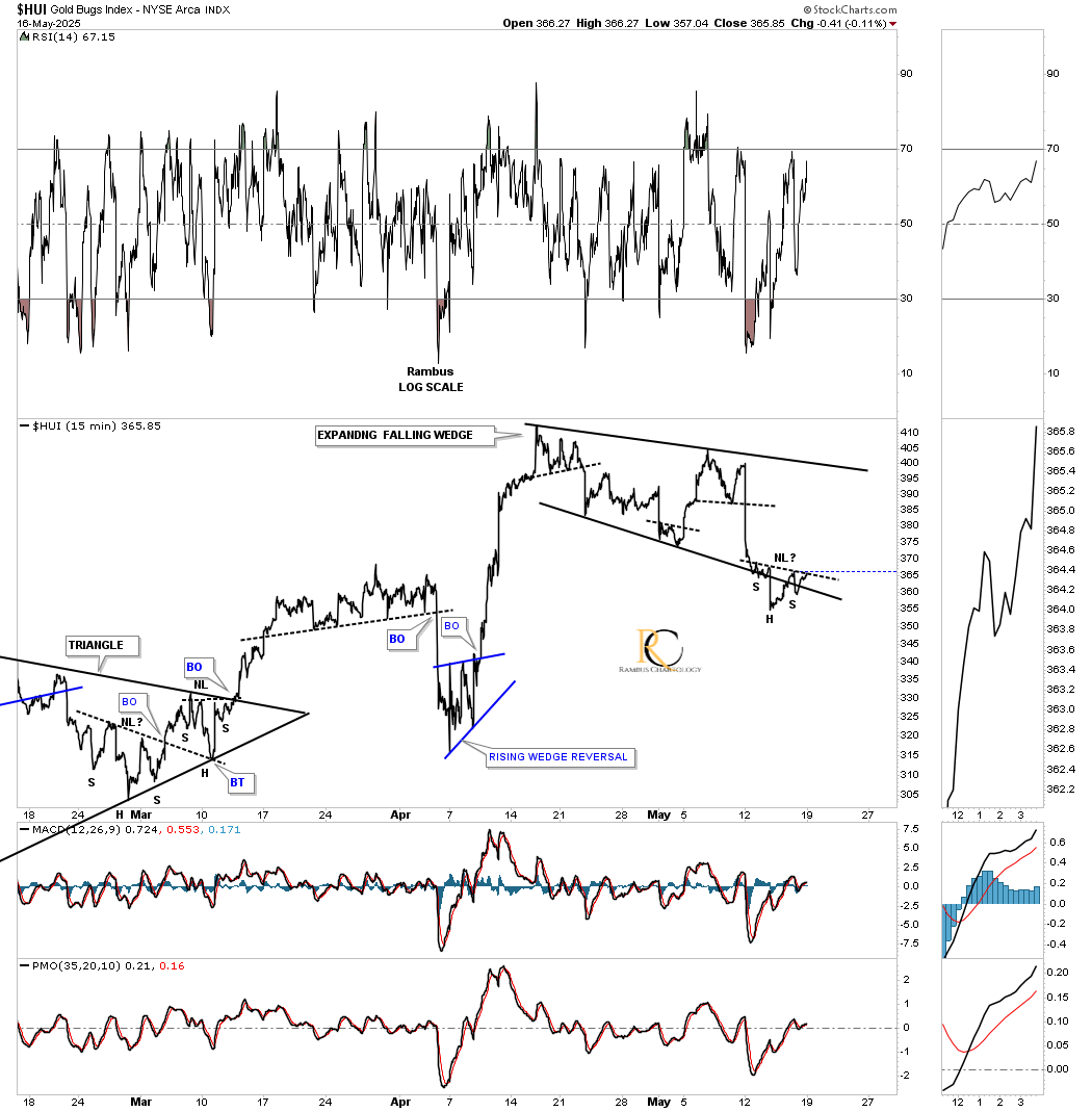
In mid-April, the HUI formed a small micro topping pattern and began to consolidate the previous rally. Last Wednesday, the HUI strongly tested the bottom rail of the potential bullish expanding falling wedge, forming a possible small H&S bottom at the 4th reversal point. We should know early next week if the micro H&S bottom is valid. I will tweak the bottom trendline once the small H&S bottom is confirmed, which will show a slightly steeper lower trendline.
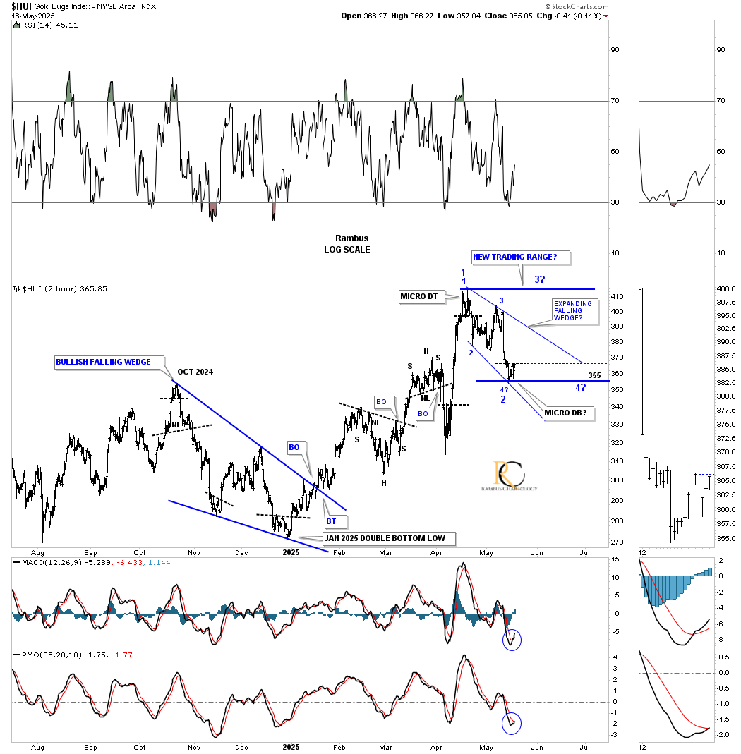
Next is a longer-term 2-hour chart, which shows how the expanding falling wedge on the 15-minute line chart above fits into the slightly larger picture. If you recall, I initially called the first reversal point a micro double top, and even though it’s very small, it was still a reversal pattern. Over the next month or so, the HUI has carved out the expanding falling wedge and is working on the all-important 4th reversal point.
On the 15-minute line chart above, the potential 4th reversal point looks like a micro H&S bottom, and on this larger timeframe chart, we can see a micro double bottom/H&S bottom (see thumbnail on the right sidebar). If this current low can hold support, then we can see another rally up toward the top of the possible new trading range.
The two possible scenarios we could see unfold are: the expanding falling wedge could be a standalone consolidation pattern, meaning the HUI will breakout above reversal point #1 and continue its next impulse move higher. What I think is more probable is that the HUI could be forming a larger consolidation pattern, which would need one more rally and decline to complete the four reversal points. Either scenario would have a bullish outcome.
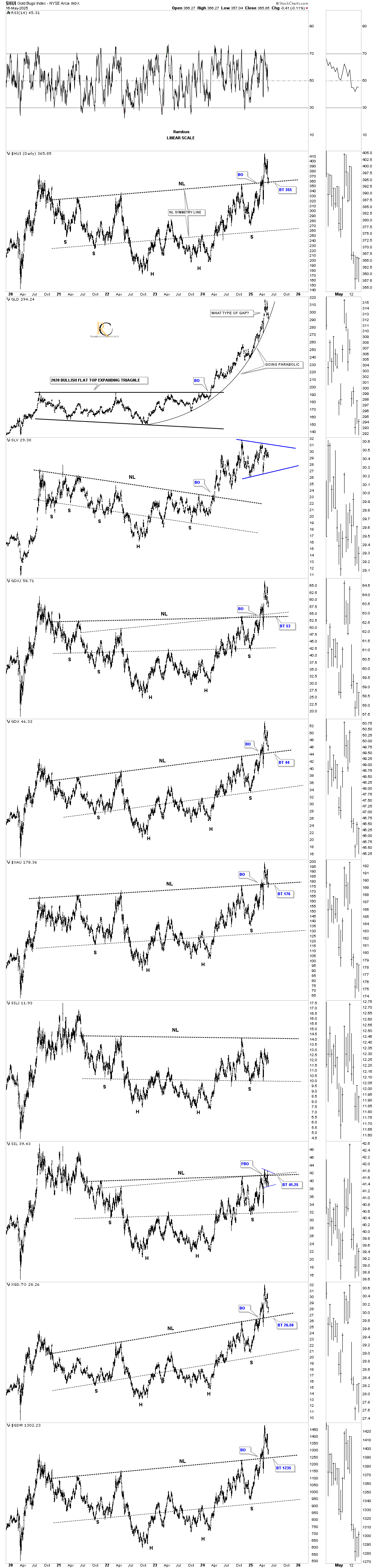
Next is a longer-term daily chart, which shows the previous two black consolidation patterns that have formed since the March 2024 low and led to a decent impulse move. From a pure symmetry perspective, it just looks like a new consolidation pattern would fit in very well within the uptrend. Keep in mind that these small consolidation patterns are what keep the strong rally phase going, because without them, we would see a very strong rally that burns itself out quickly, think the 2016 and 2020 vertical moves, which then took years to consolidate those moves once they ended.
I know consolidation patterns are no fun when they’re building out, but they’re a necessary evil that will frustrate most investors until they sell their shares at precisely the wrong time. Knowing what may be taking place still isn’t any fun, but at least one can understand the process to better deal with it.
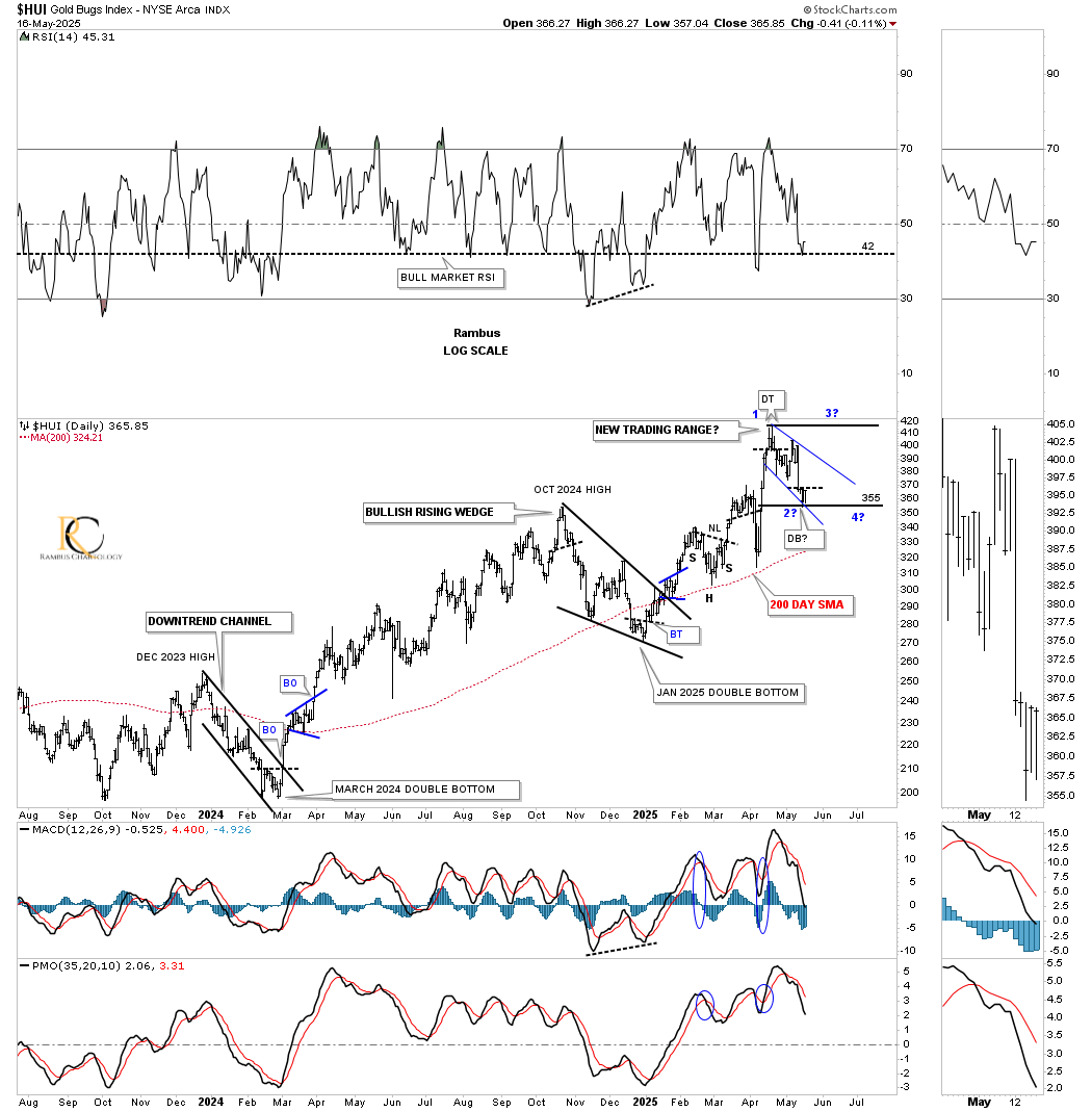
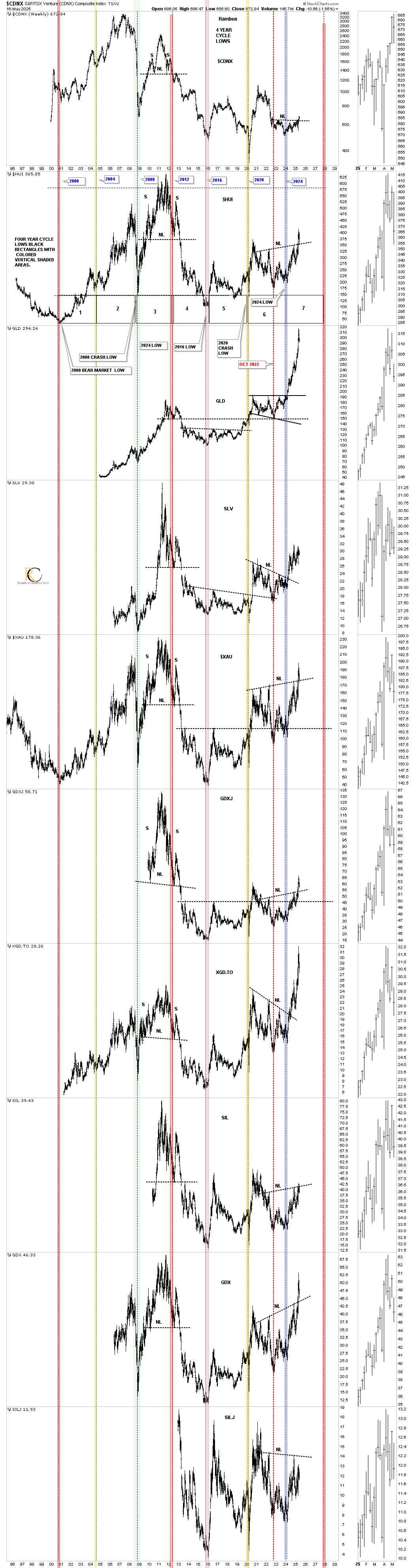
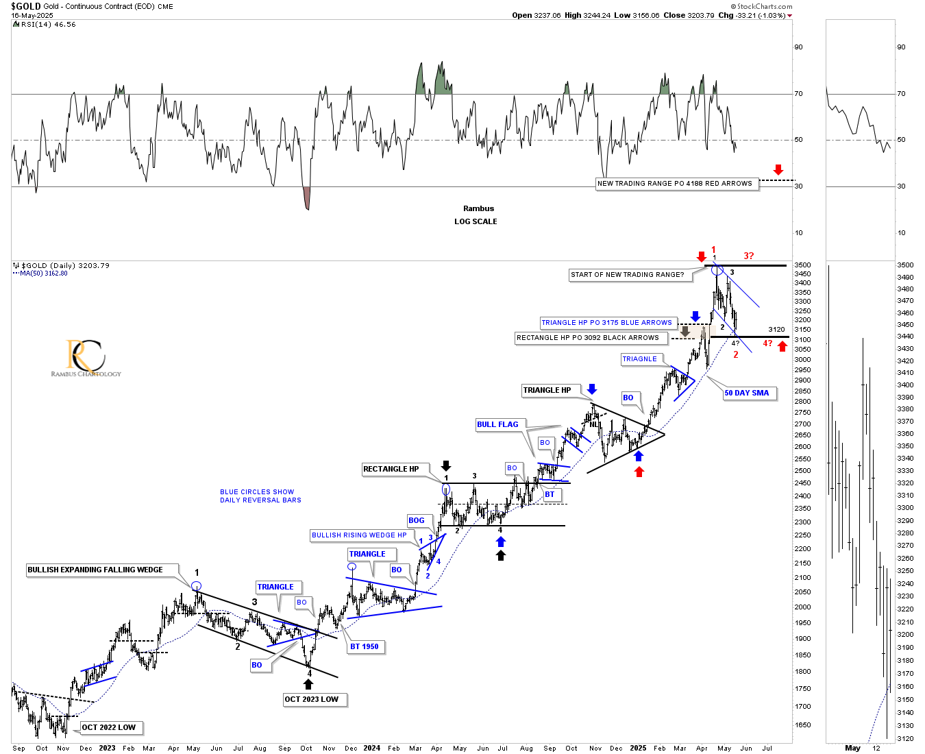
Let’s put this daily combo chart, which shows the four-year H&S consolidation patterns, into perspective. This daily bar chart shows the initial breakout and strong backtest to the neckline before completely breaking out. The expanding falling wedge on the 15-minute and daily chart above is forming the backtest, which is also another important reason that the 4th reversal point needs to hold support. So far, so good in most cases.
To put those four-year H&S bottoms into perspective, on the daily chart above, below is the four-year cycle low combo chart going back to the 2000 low and the beginning of the secular bull market. In most cases, the head or the right shoulder low fell on the four-year cycle low in March 2024.
When the 2011 H&S top completed, most PM stock investors didn’t recognize it for what it was: the end of that leg of the secular bull market that ushered in the bear market that didn’t end until the 2016 low. I believe this current four-year H&S bottom, which is fairly close to the 2011 H&S top in time and price, will lead to much higher prices, inversely to the 2011 H&S top.
We can now see the breakout of the H&S neckline on the CDNX, which has been a long time coming. Also, what’s important to see is that since the breakout above their necklines, most of the PM complex indexes have made a new higher high and higher low, with SIL and SILJ still showing relative weakness.
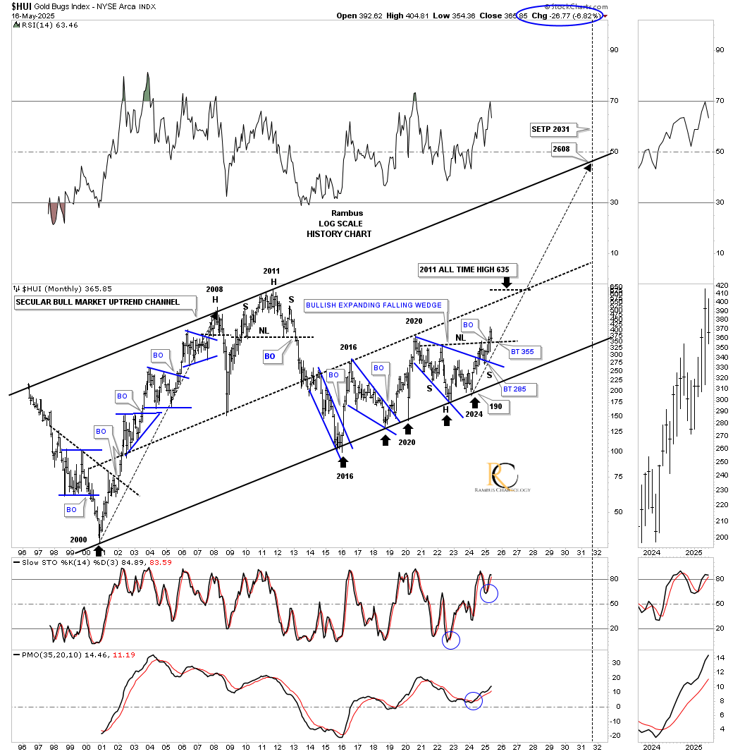
Let’s go one step further and look at the long-term monthly combo chart, which has the 2011 triangle consolidation patterns on it. I’ve used up all my annotations, but I was able to show the HUI properly annotated. I’ve been showing these 2011 triangles for quite a while, which show a nice clean breakout and backtest for the most part. I just added the four-year H&S consolidation patterns to these charts, which should now complete all the work after the current backtest completes its job.
In the apex of the 2011 triangles, you can see the top rail of the 2011 triangle with the blue 2020 bullish expanding falling wedge and now the H&S consolidation pattern neckline. The breaking out and backtesting process has been playing out very well, as shown by the breakout of the top rail of the 2011 triangle and blue 2020 bullish expanding falling wedge, followed by the backtest. Next came the rally off the backtest above the neckline, and now the backtest from above, which is classic Chartology.
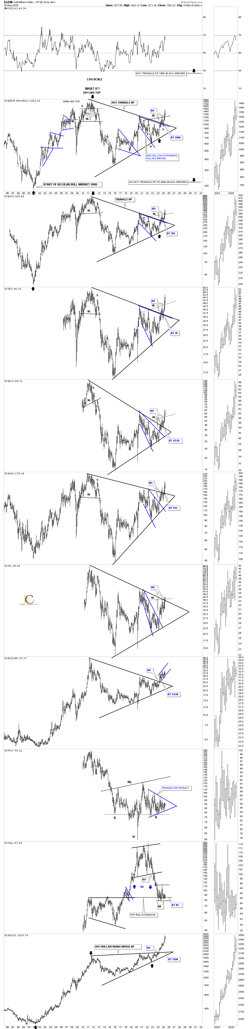
Below is the history chart for the HUI, which shows the 2011 triangle consolidation pattern a little more clearly, along with the price objective using the 2011 triangle as a halfway pattern, as shown by the black arrows.
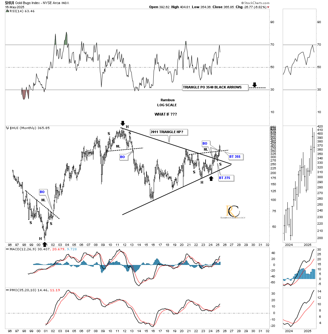
Here again, on this history chart for the HUI, you can see the very clean breakout and backtest currently taking place.
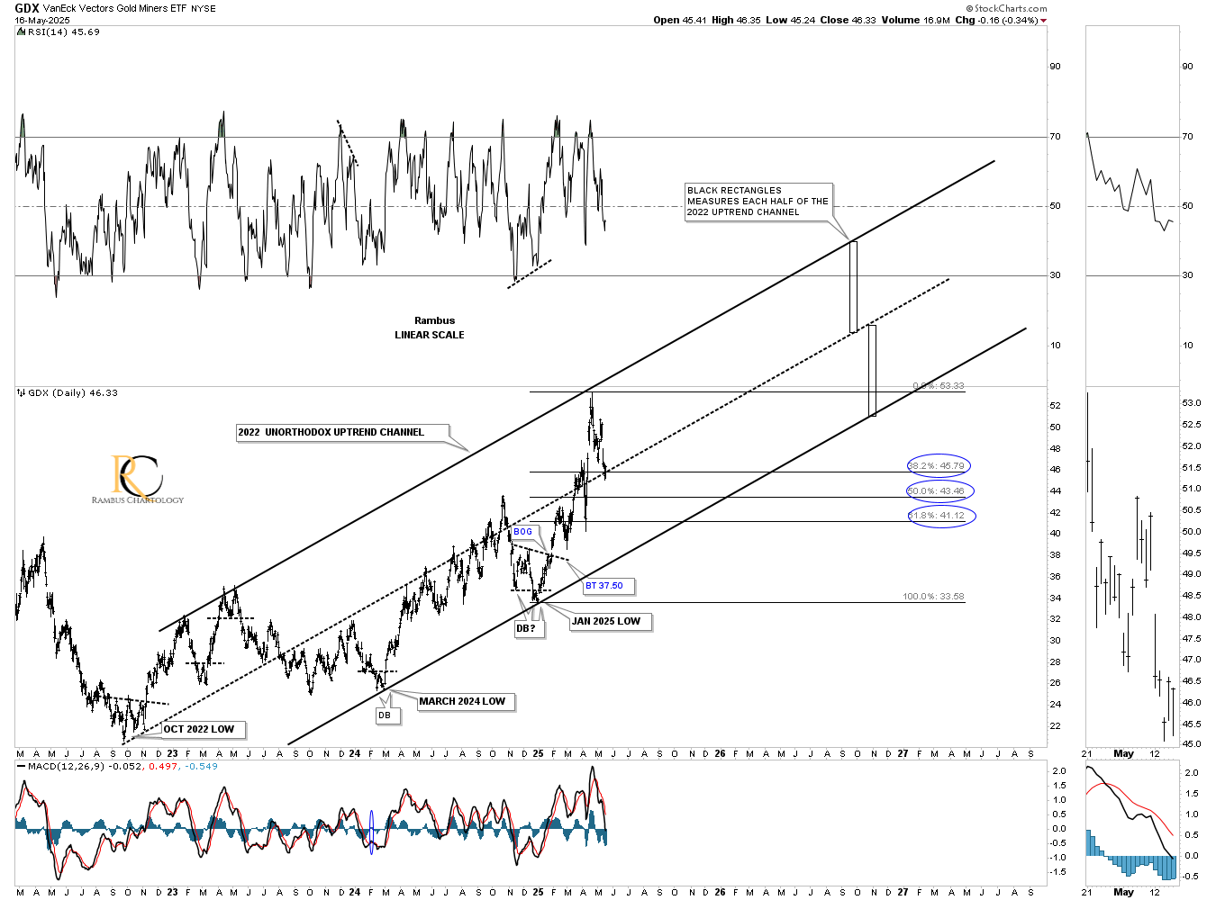
Below is the unorthodox uptrend channel for the GDX, where the center dashed midline begins at the 2022 low. After almost reaching the top trendline in April, the GDX has corrected to a 38% retracement of the rally out of the January low made earlier this year. Note how, during the first year or so of the uptrend channel, the GDX traded above the center dashed midline, and then when it gave way, the GDX traded below the center dashed midline until just recently, and is now testing it from above. It’s possible that the GDX could now trade above the center dashed midline for quite a while before we see a bigger correction.
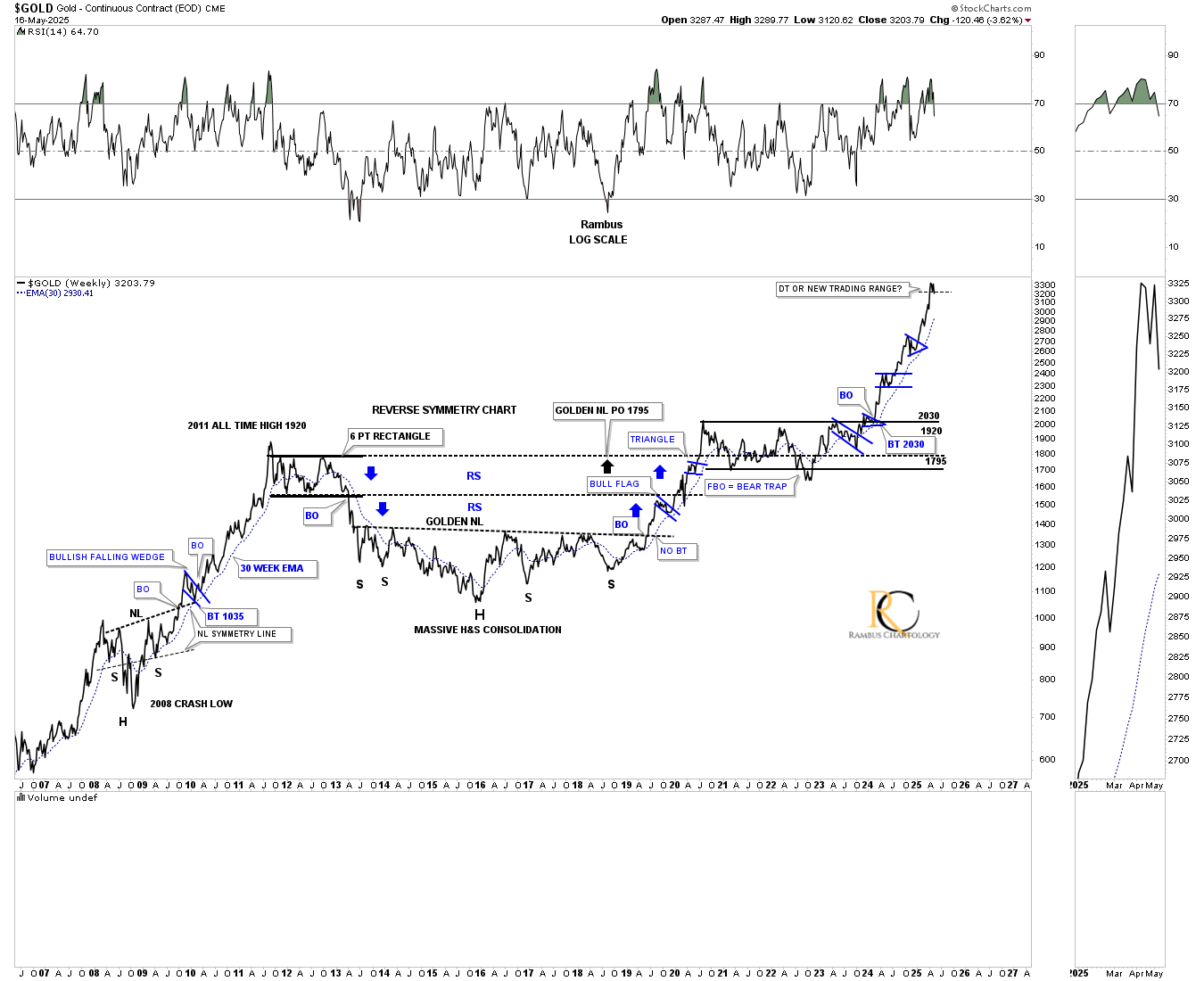
Moving on to gold, below is a short-term daily chart, which shows the price action since September of last year forming a nice parallel uptrend channel. The back dashed horizontal lines are supporting and resistance lines taken from the high of the preceding highs or consolidation patterns.
Similar to the short-term setup on the HUI we looked at earlier, you can see gold is working on its potential 4th reversal point in the blue flag, where the black dashed horizontal S&R line is taken from the previous high made on the way up around the 3150 area.
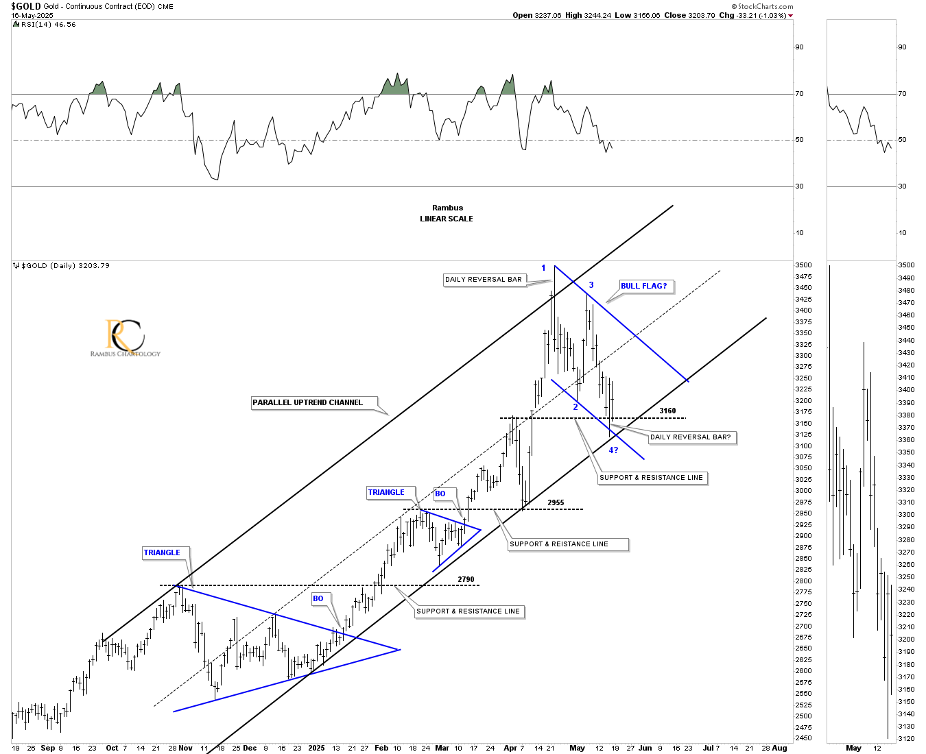
Also similar to the daily chart for the HUI we looked at earlier, gold could be forming another black consolidation pattern, which again would be a healthy development because of the parabolic nature of the October 2022 rally.
Many times, a larger consolidation pattern will begin with a falling wedge, flag, or expanding falling wedge, which can mark the 1st and 2nd reversal points. I made the potential reversal points in the possible larger consolidation pattern red, so it would be easier to see.
If – and I’m getting way ahead of myself – but if gold is currently forming another black consolidation pattern, the red arrows show the potential next price objective. The black and blue arrows showed us where to look for the minimum price objectives for the previous impulse moves, the brown shaded price objective zone. Until something changes, the series of one consolidation pattern forming on top of the previous one keeps the rally out of the 2022 low intact.
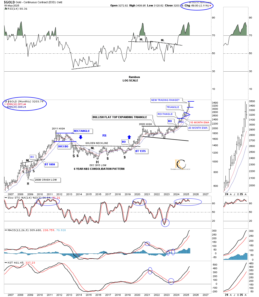
To be fair, I have to show you this weekly reverse symmetry line chart we were following during the formation of the 2016 H&S consolidation pattern with the golden neckline. A line chart can show a double top much clearer than a bar chart on many occasions. Looking at the thumbnail on the right sidebar, you can see what looks like a possible double top, which we need to respect.
Next is a weekly chart, which shows the rally into and out of the 2020 bullish flat-top expanding triangle. If the current correction gets deeper, the 30-week EMA would be the first area of support, and then the top of the blue triangle and 65 week ema.
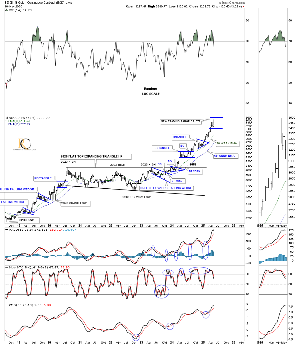
Looking at this much longer-term monthly chart, you can see the two previous small blue consolidation patterns that formed after the breakout from the 2020 flat-top expanding triangle, with the possible 3rd one under construction. The 10- and 20-month EMAs should hold long-term support.
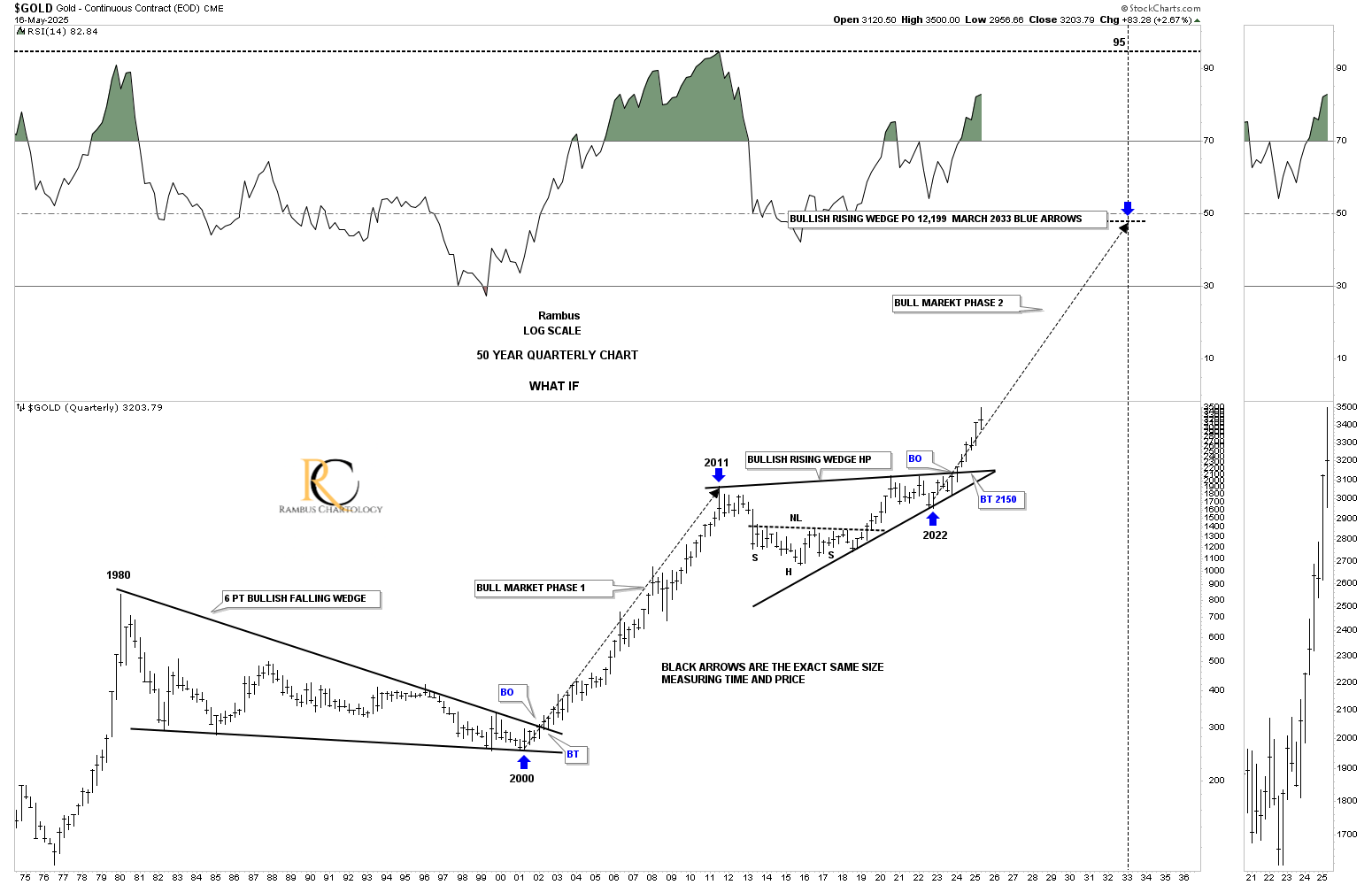
This last chart for gold shows the 1980-to-2000 bear market, which formed a 6-point bullish falling wedge that led to the 11-year bull market. So far, the current angle of the rally out of the 2011 bullish rising wedge is matching the angle of the 2000-to-2011 bull market pretty closely, long black arrows.
Let’s look at a few charts for the US stock markets to see if we can make some sense out of the recent rally.
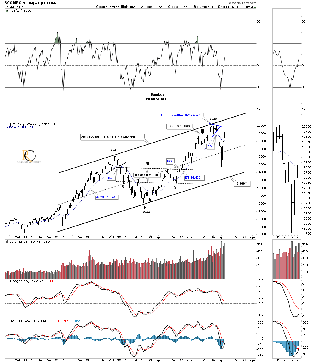
Before the correction began earlier this year, I had been pretty bullish on the stock markets, but a few warning signs showed up, and I became cautious, at least in the short to intermediate term. Below is a 25-year chart for the COMPQ, which shows a perfect parallel uptrend channel that formed the blue 5-point triangle reversal pattern just below the top trendline, which led to the decline.
One reason I stayed in the bearish camp is because I thought we could see the bottom trendline reached, which is still possible, but with the gap above the 30-week EMA last week, I have to lower the odds. If the COMPQ reaches the top trendline once again, I will attempt to go short one last time, using the top trendline as my line in the sand. Currently, I’m using the sell/stop above the double top trendline as my exit point on the short positions we currently have.
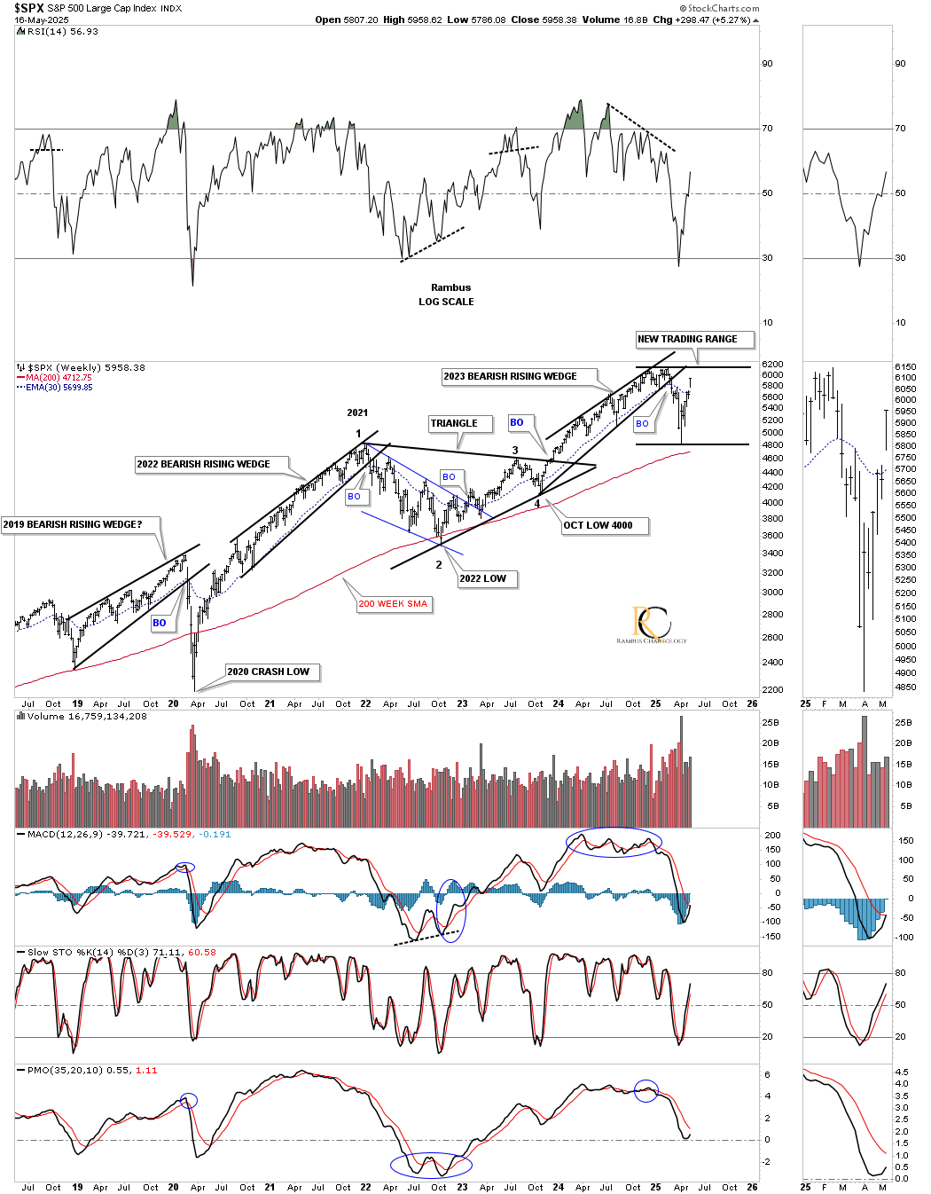
Next is a weekly chart for the SPX that we’ve been following for many years. As you can see, there are three bearish rising wedges, with the first one leading to the 2020 crash low. The second one formed in the impulse move to the 2021 high, which led to that almost two-year triangle consolidation pattern. The third bearish rising wedge led to the recent decline, which could be forming a possible new trading range. Note how similar the price action is to the 2021 high and initial decline and rally to form the top rail of the blue bullish rising wedge. The SPX never traded above the 2021 high until the triangle breakout.
The 2021 triangle shows you a good example of how a larger consolidation pattern can have a smaller pattern or multiple smaller patterns in it, as shown by the blue bullish falling wedge, which we discussed at the beginning of this post, and which is possibly taking place right now on the HUI and gold.
Earlier this year, we also looked at the monthly chart for the SPX showing three important uptrend lines. The top trendline connects the 2000 high to the 2022 high and then the 2025 high. The 2007 uptrend line also connects the 2022 high, with a slight overshoot in 2025. The bottom uptrend line connects the 2009 and 2020 lows. If the SPX can trade above the 2000 top trendline and break out above the 2025 all-time high, the bulls will definitely be in charge.
You can see the almost 10-year negative divergence on the RSI, but from a long-term monthly perspective, negative divergences like that can last a very long time. You can also see the bearish cross on the MACD, with the blue histogram also trading below the zero line, which can also be bearish.
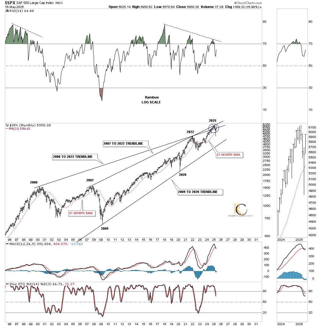
If the bulls are truly in charge and we’ve just experienced an intermediate-term correction, then the secular bull market that began at the 2009 low is still alive and well, with many more years to run.
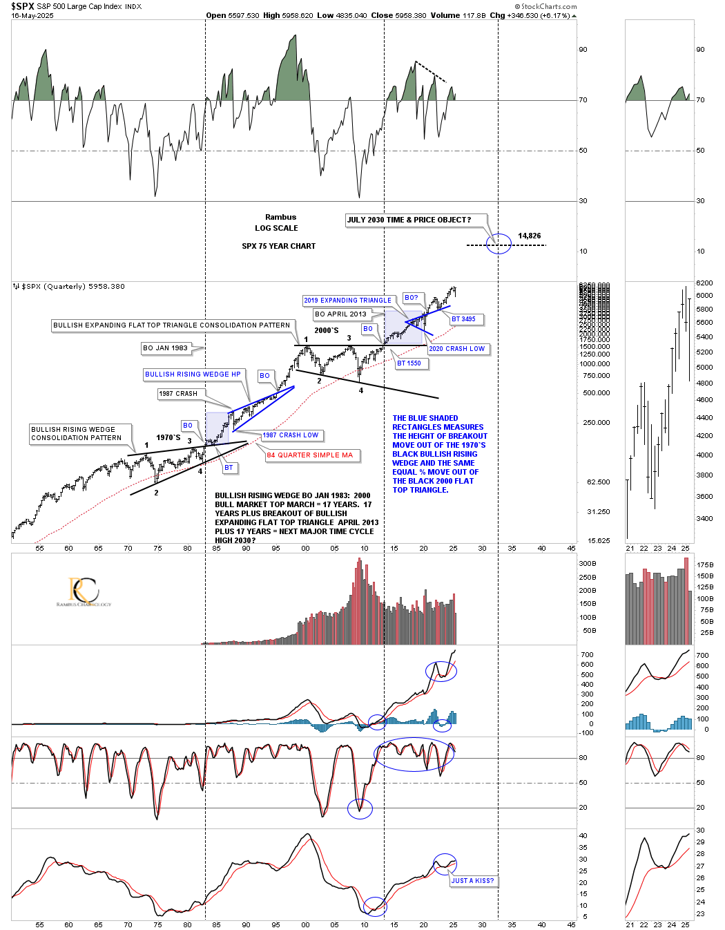
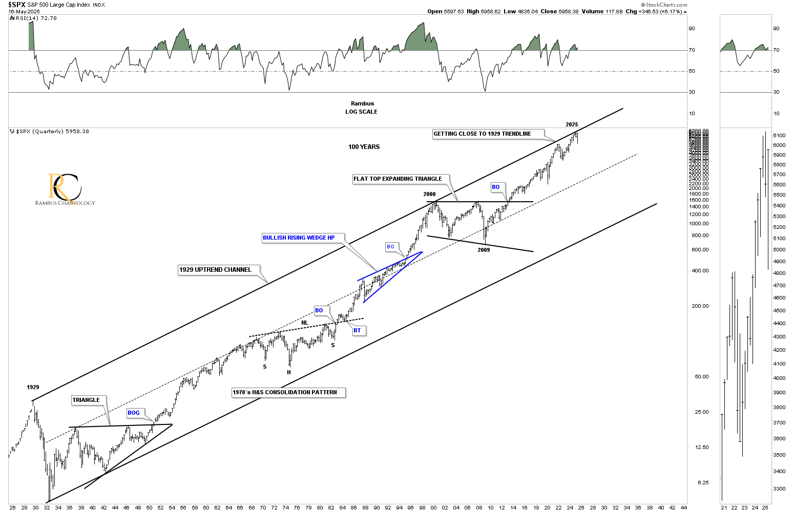
This last chart for tonight is the 100-year quarterly chart for the SPX, which shows its 100 year parallel uptrend channel, with the price action hitting the top trendline earlier this year. When you see that in real-time, it’s hard not to get bearish.
The precious metals complex is now testing critical support in what could be the beginning of its next consolidation phase. Or, if the small expanding falling wedge on the 15-minute and 2-hour charts turns out to be the next consolidation pattern, think backtest to the four-year H&S bottom neckline; then the next impulse move is close at hand. The way the short-term charts are set up, we should know something early this week. All the best… Rambus.
********
 Meet Rambus, a seasoned trader and technical analyst renowned for his unbiased and insightful chart work. Through his website, Rambus Chartology, and Substack newsletter, Rambus shares his expertise with a global community of subscribers, providing daily updates, commentaries, and hands-on training in the art and science of chartology. With his calm, humble, and down-to-earth approach, Rambus demystifies complex market trends, helping his followers navigate the challenges of today's volatile markets. Join the Rambus Chartology community today and discover a unique blend of technical analysis, trading expertise, and time-tested protocols. Subscribe now at www.rambus1.com or https://rambuschartology.substack.com/
More from Gold-Eagle


