Gold Stocks, North or South?


We have all witnessed the great rally of gold in the past few months, reaching beyond $700, and then just as quickly, fell to $560 within days, and now we have rebounded, reclaiming 50% of the plunge. Where to from here? We are already positioned on GLD, therefore, this special report takes a look at our other ETFs, which are GDX for our US traders and XGD.TO for our Canadian traders.
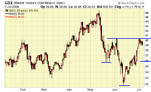
GDX - the daily chart clearly shows an inversed "head & shoulder" pattern in progress, whether it will end up that way is anyone's guess, and technical analysis is nothing more than an educated guess. To enter and exit the markets, we must follow our signals and set ups. Price and patterns are dynamic and subject to constant change.
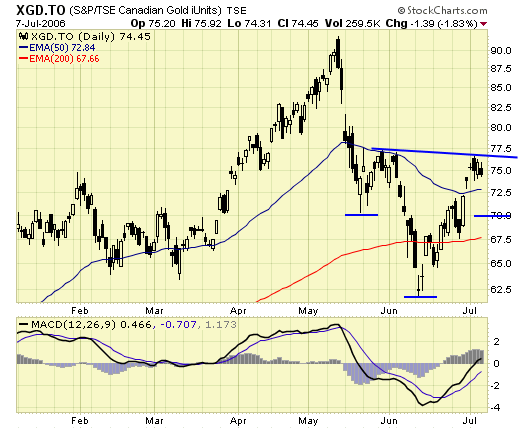
XGD.TO - shows a similar bottoming formation.
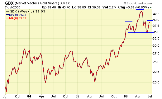
Unfortunately, looking at the weekly time frame, something ominous is also developing, namely a head & shoulder top.
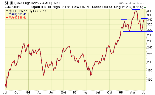
That head & shoulder top is also showing up in the $HUI…
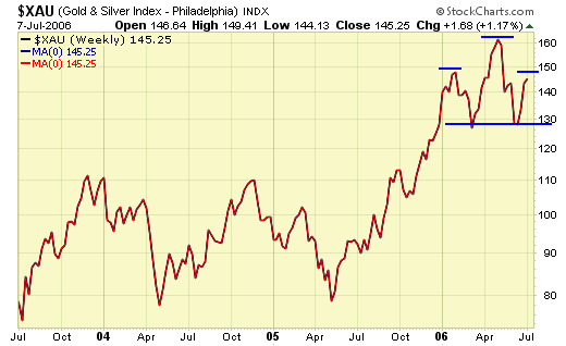
and the $XAU…..
Summary
So, we have a potential head & shoulder top forming in the weekly time frame, and a potential inversed head & shoulder bottom in the daily time frame, and the resolution will only favor one of them and not both, which one will it be?
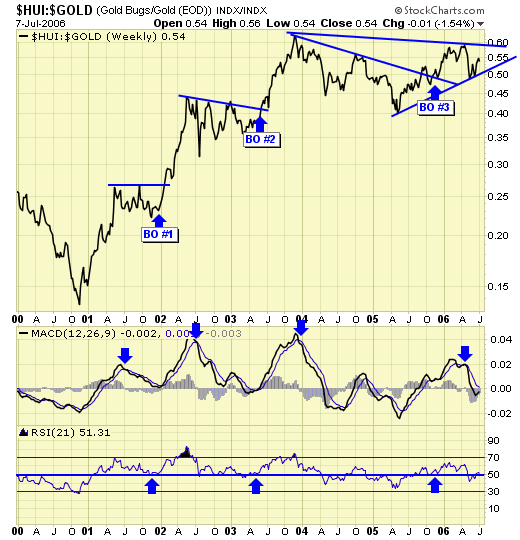
For that, we must go back to our "breakout model" again. This model shows precisely the stand off between the bulls and the bears. If the head & shoulder bottom wins, we should see a breakout soon after. If the head & shoulder top wins, we should see a breakdown shortly after. But if we look carefully at the breakout model again, we can get a glimpse of the future based on the current performance. After we had BO#3 in Nov, this ratio chart failed to reach a new high because the top in May is lower than the top in Dec 2003. But the price of gold, the $HUI, and the $XAU all reached new highs in May. What this ratio chart tells us is that despite making new highs this year, gold stocks in general are under performing gold, in relation to previous rallies. Take a look also at the MACD and RSI, the top in May this year is considerably lower than the tops in 2002 and 2003. This in itself is a bearish divergence.
After showing this breakout model last week, one reader opined that this ratio chart is actually very bullish, because what it indicates is that gold stocks are undervalued relative to gold. Sorry, I don't buy that. Gold stocks should be undervalued if we were at bear market bottoms, such was the case in 2000 and 2001. Gold stocks should be overvalued at bull market tops, and continue to be even more grossly overvalued at each new top. When gold stocks become undervalued at a new top such as what we saw in May, then a caution flag is raised.
We cannot predict the future, but we surely can prepare for it. Knowing the market can go either way big time in the next few weeks, now is not the time to be heavily long or short. There will be plenty of time to board the next train, whether it is going north or south.
********

Jack Chan is the editor of Simply Profits, established in 2006. Chan bought his first mining stock, Hoko Exploration, in 1979, and has been active in the markets for the past 37 years. Technical analysis has helped him filter out the noise and focus on the when, and leave the why to the fundamental analysts. His proprietary trading models have enabled him to identify the NASDAQ top in 2000, the new gold bull market in 2001, the stock market top in 2007, and the US dollar bottom in 2011.


