The Lundeen Bear Box & Step Sum
This article is my third in a series examining the historical importance of the Dow Jones Industrial Average (DJIA). The DJIA may be an outdated metric to some, but no other measurement of the American stock market spans three centuries. This venerable average still has much to teach us.
A summary of my first two articles on the DJIA is in order.
1). Dow Jones Industrials -40% Declines 1885 to 2008
The first article examined the DJIA's * weekly * closing prices from 1885 to 2007 using a technique called "The Bear's Eye View" or "BEV" Chart. The BEV Chart compressed the DJIA's 123 years history into percentage terms expressed between 0% and -100%. Using the BEV Chart, we saw that from 1885 to 1974, the DJIA had a natural rule of thumb that I have never seen commented upon previously.
This rule holds that when the DJIA declines 40% below its pervious all time high (BEV Terminal Zero), it provided investors with a once in a generation buying opportunity. In the 123 year history of the Dow Jones Averages, the only exemption to this rule was the 1929 bear market. In 1929, the 40% rule of thumb proved to be a disastrous bull trap.
As the BEV Charts for the 1929 & 2007 bear markets were strikingly similar, I started a weekly Bear Market Race to the Bottom report. In it I am providing a side by side comparison of the 1929 & 2007 bear markets' BEV Charts at the end of each week's trading. These reports are published weekly in Le Metropole Café and Gold Eagle.
2). Dow Jones Industrials Average Market Volatility
In the second article in this series we examined the day to day closing price change from 1900 to 2008. I used * daily * DJIA data which prevented me from using data from 1885 to 1900. Microsoft's Excel does not do dates before 01 Jan 1900. We saw that "policy" motivated "liquidity injections" of a sufficient magnitude created a condition in the stock market I called:
PEV exists when daily closing price volatility's 200 day moving average:
- Rises above the 1.0% line and remains there for over a year.
- Peaks above the 1.5% line.
The above two conditions in the DJIA are extremely market conditions. From 1900 to 2008, PEV existed only during the Great Depression bear market. However it is apparent that the 2008 bear market is slipping into a PEV state.
To actually push the DJIA's daily volatility into these extreme conditions, daily market moves * both up and down * must on the whole be well in excess of 1.0% for over a year. Frequent, and prolonged periods of up and down volatility in excess 1.0% is nothing to cheer about even if on the upside.
I concluded that frequent "liquidity injections" administered to the financial markets by the "dismal scientists" who manage our day to day operations of "monetary policy" are actually making their patient ill with "monetary toxic shock syndrome."
This being the case, I've included a volatility chart comparing the volatility of the 1929 with the 2007 bear market in my weekly Bear Market Race to the Bottom Report.
In Keeping with my theme of examining the DJIA bear markets that fell 40% or more from their bull market's terminal zero, I dug deeper into the DJIA daily closing prices and found another rare event that I am naming after myself: The Lundeen Bear Box.
The results of the four Bear Boxes from 1900 to 2007 are seen below. As I am only examining the -40% bears, there may be more to be found as well in their mirror images: Lundeen Bull Boxes.
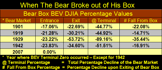
Not every bear market examined in this series developed a Lundeen Bear Box. The existence of a Lundeen Bear Box by itself * does not * imply the existence of an extraordinary hazardous market condition. As I understand what I see, the Lundeen Bear Box shows bullish market sentiment out of joint with the bearish primary trend of the market. In a word: denial.
I advise my readers to skip down and quickly examine the charts at the end of this article. I have a chart for every -40% bear market since 1900. It is necessary to see the Lundeen Bear Boxes before reading my interpretation of what is occurring within them.
In the table above (108 years of DJIA history) each Lundeen Bear Box was resolved to the downside. The percentage decline of the DJIA when the bear "broke out of his box" can be seen in the far right. Typically, the Lundeen Bear Box develops later in the bear market after the bulk of damage to asset values has already occurred. The worst of the bear market is already over when this chart pattern forms.
The Bear Box identifies a point in time when the market bulls, * incorrectly * believe it is safe to come back into the market. When the bulls realize that they are on the wrong side of the market, they once again sell. The bear box is violated when the bulls exit their bullish positions. This allows the Step Sum plot to again trend bearishly in sympathy with the bearish DJIA plot. The bear market now declines to its terminal bottom.
So the Lundeen Bear Box is a late stage bear market chart formation. It occurs when the bulls incorrectly believe the bottom is in when in fact the aging bear market is still having its way with market prices. Markets that fail to develop a Lundeen Bear Box are markets with smarter and more patient bulls. But then a -40% DJIA bear market is an extreme and rare event. The bulls are not to be faulted for showing some guts in the line of fire, as long as the money being lost is their own.
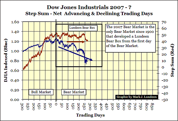
The Lundeen Bear Box for the 2007's -40% bear can be seen in the chart below. Note that the DJIA is indexed to 1.00 and not the BEV format used in my first article. Note also that the 2007 Bear Box developed at the very market top of the bull market. This is a first. In the 108 years of DJIA market history examined in this article, the bear boxes formed much later in the bear market. But in the chart below we see that right from day #1 of the 2007 bear market, a Lundeen Bear Box has formed and this Bear Box contains the entire -40% of the 2007 bear market! These bulls are either stuck on stupid or using US tax payer's money!
The bulls opposing the 2007 bear market's primary trend are in total denial. They may be armed with a financial "bazooka" armed with "unlimited credit," but this bear is showing serious disrespect to "policy decisions" concerning the pricing of financial assets.
To understand these charts, I must first explain my Red "Step Sum" plot.
The "step sum," like all of the technical indicators used in this series on the -40% DJIA bear markets, is derived solely from the daily, or weekly closing prices of the DJIA itself. This is the DJIA telling its own story. The table below shows 16 trading days sometime in 1900. As the data used is my factor-corrected Dow Jones Averages data series, these exact values will not be found in a Dow Jones Averages reference book. The table below shows how a Step Sum series is constructed using DJIA daily closing prices.
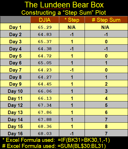
Think of the "Step Sum" as the sum total of all the up and down "steps" in a data series as prices change over time. An Advance - Decline Line for a data series derived from the data series itself. Logically, to have more up days than down days during a bull market makes sense as does having more down days than up days during a bear market. Understanding the Step Sum is no harder than that.
But amazingly, in every bull or bear market, there are just about as many up days as there are down days. The chart below tells the story.
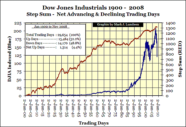
Since 02 January 1900, the NYSE has had 29,654 trading days in which the DJIA has closed either up or down from the previous day's close. Yet from the first trading day of the 20th century, the DJIA has seen only a net 1,314 up days as of 07 November 2008! I have found that this small net of up to down days contains information on market sentiment.
Examine the texture of red Step Sum plot in the chart above. Can you see that it resembles teeth on the edge of a saw? Yes it does except during the two most significant bull markets of the 20th century: the Roaring 1920s and the Greenspan - Bernanke Bubble Markets. Something happened to the stock market in the Roaring 20s and again in the later part of the 20th century. Let us just call it "Policy." Apparently, when "policy" smoothes my Step Sum plot, markets that know-no-fear are created. "Policy" directed "liquidity injections" in the 1920s and during the Greenspan era created a public mind-set that making money in the stock market was the way to easy wealth.
In the Chart below we take a look at the DJIA and its Step Sum's from 1960 to 1987. Here we see a period of decline in the Step Sum plot from 1966 to 1985.
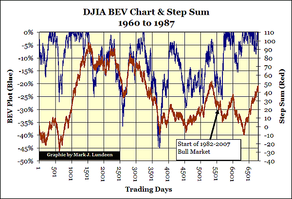
This decline from +98 on 25 January 1966, to -10 on 08 April 1985, is only a net 108 down trading days in the DJIA's Step Sum over a nineteen year period. Yet it correctly identifies the most frustrating period of stock trading in the 20th century as well as tells us the dark despair present in August 1982 when a huge bull market was born.
But "policy's" hand was present in the above chart too. I wrote an article in 2005 concerning the DJIA and inflation. In it I go into some detail about the period above. In 1982, then Fed Chairman Paul Volcker kicked-started the economy in the second week of January of 1982 by increasing M-1 by 23% in a single week! Up to that time, nothing like it was seen in the world of "policy." By August 1982 this "liquidity injection" hit the stock market and nothing has been the same since. Even Lundeen Bear Boxes now form on the first day of a bear market.
Below are the -40% Bear Markets since 1900. The Step Sum Plots provide superb insight into the market psychology of the traders.
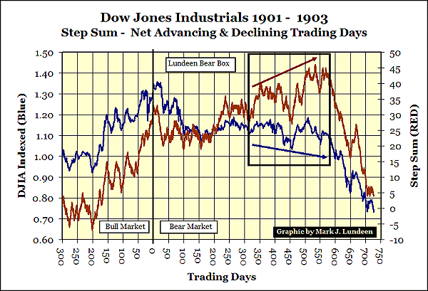
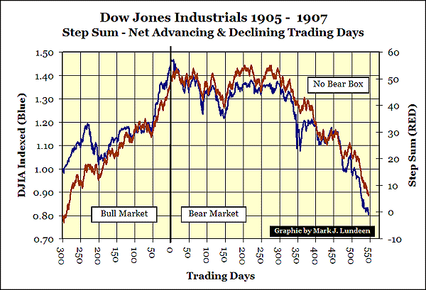
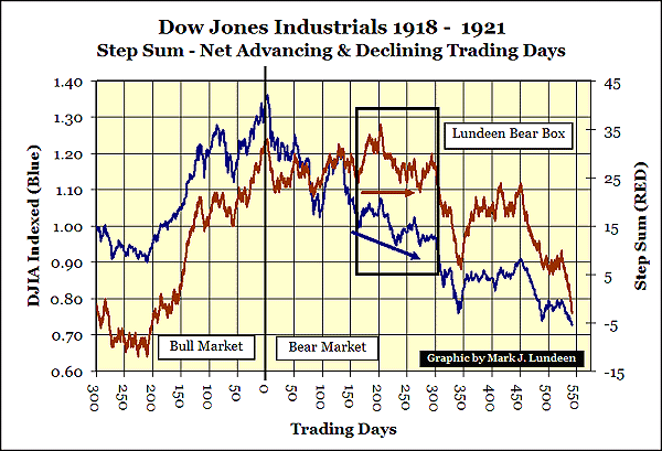
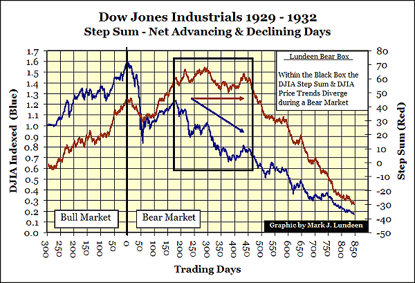
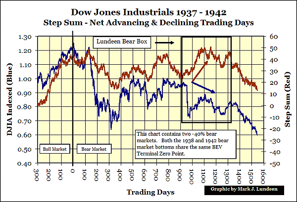
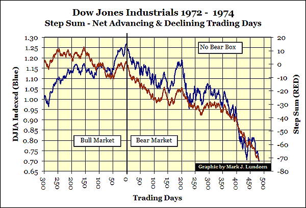
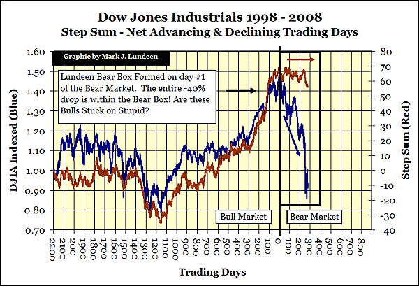
The 1998 to 2008 chart is an ugly chart. What happens when the bulls exit their bullish positions? I believe that the 2007 bear will finish as the second worst bear market since 1885, at a minimum.
Go back to the table and examine the market declines when the bear comes out of his box. Even the smallest decline from out of the box would put the 2007 bear in the #2 position. But when I consider the implications of everything I have discovered in this three part series, I believe that this bear market could be historic.
But let's give credit where credit is due. This bear market has benefited greatly from the best "policy" money can buy. One of these days, this bear will take a piece from the "policy makers" themselves. I suspect we will see it first in the 2007's Lundeen Bear Box. You buy them shoes and send them to college and this is what they did to us? The current gang of economic PhDs managing "policy" should only be allowed to publish books on economic black operations for the CIA. Nothing survives their touch.
As I've said before, I am not cheering for the 2007 bear. But after reviewing my work in these three articles covering the DJIA -40% bear markets, I can't be optimistic about the prospects of being long in the stock market. And for someone who is taking a bearish position, they see their counter-parties rolling over daily on CNBC.
This is exactly what happened in the 1930s. Rock solid positions turned into quicksand. So where is safety to be found? In the 1930s the only stock group that ultimately prospered was the gold mining shares. As in 2008, gold mining shares fell with the rest of the market, at first. But in the Great Depression, as the crisis deepen; Homestake Mining and Alaska Juneau Gold reversed and took off to become very profitable to their shareholders.
Time will tell whether or not the past will be prologue for the 2007 bear market. No doubt "policy" is opposing such a bull market in the gold mining stock sector as I write this. But looking at how successfully they have handled the bear market everywhere else, fighting a precious metal bull will be another battle "policy" will lose. When they make the US dollar worthless, gold and silver will shine!
If anyone interested in researching a detailed break-down of the 1929-1933 financial markets, I recommend Barrie A. Wigmore's: "The Crash and its Aftermath."
I don't like it, but so far the 2007 bear is on track with 1929.


