Preparing For The CRASH – S&P500 Index Analysis – Inverse ETFs & PUTs Timing
 share
share
 share
share
 share
share
 share
share
 share
share
 In this update on the broad market S&P500 index, we are going to look at no less than five charts, covering different timeframes. The reason for this is that there are different points to make on each of these charts.
Before looking at the charts for the S&P500 index, we are going to review first a range of charts, including the latest charts for Margin Debt and NYSE available cash. These charts provide the direst warning imaginable of impending trouble.
The NYSE Margin Debt chart shows that it is “through the roof” – way higher than it was at the 2000 and 2007 market peaks. When the wheel comes off, out will go the margin calls setting off a brutal self-feeding cycle of liquidation…
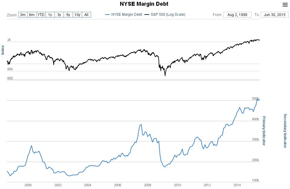
Click on chart to popup a larger clearer version.
Chart courtesy of www.sentimentrader.com
The chart for NYSE Available Cash shows a shocking extreme negative cash situation far worse than that at the 2000 and 2007 market peaks, which is of course due to extreme leveraging on capital being employed to play the market. Once the market starts falling, this leveraging is going to work in reverse.
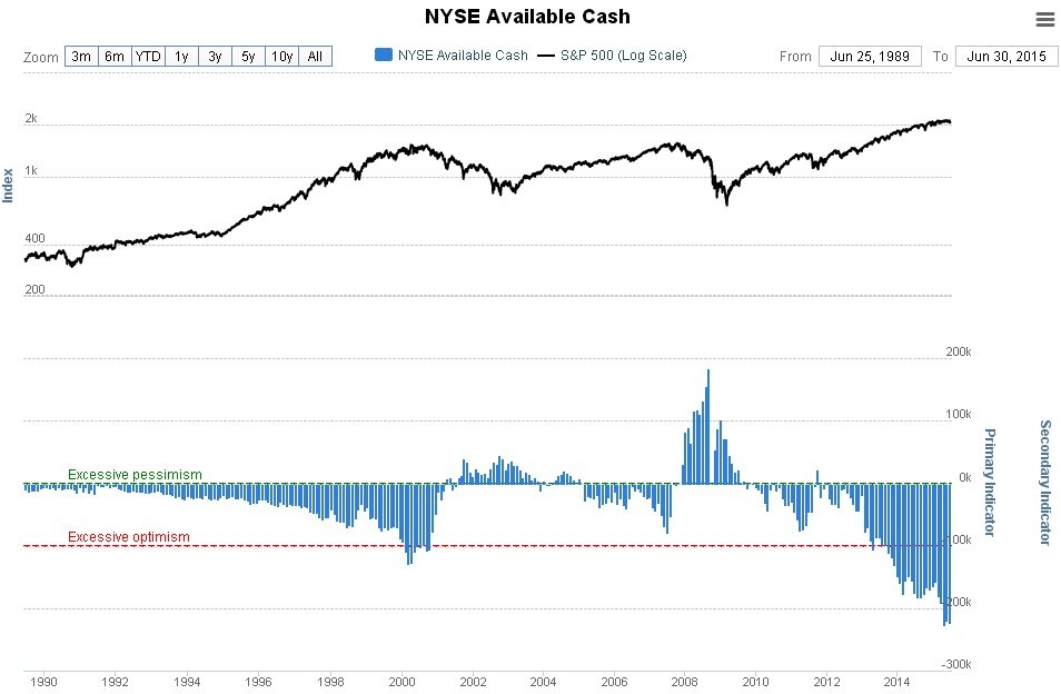
Click on chart to popup a larger clearer version.
Chart courtesy of www.sentimentrader.com
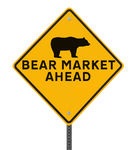
The two charts above don’t suggest an ordinary bear market decline - they point to a devastating CRASH…soon.
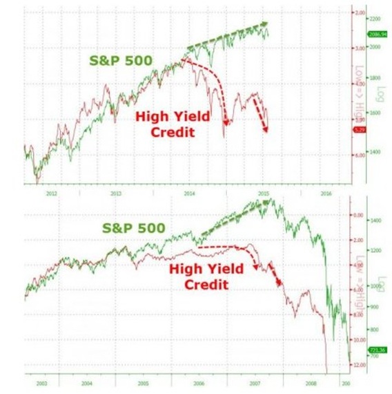
Next we take a quick look at a pair of charts that appeared in Zero Hedge, which show what happened to Junk Bond prices in 2008 ahead of the crash, and what is happening now. As you can see the same divergence is already evident, and it means trouble. The top chart shows the lead up to now, the bottom chart the lead up to the 2008 crash.
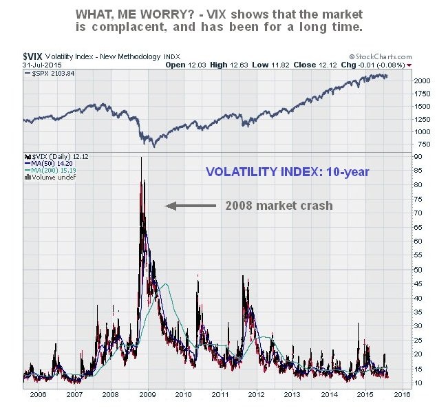
Now we will look at the latest Volatility Index (VIX) chart, which makes plain that a lot of investors are sitting contentedly in their comfy armchairs, perfectly happy with the current state of affairs, completely unaware that very soon their armchairs will be upended and they will find themselves sprawled on the floor….
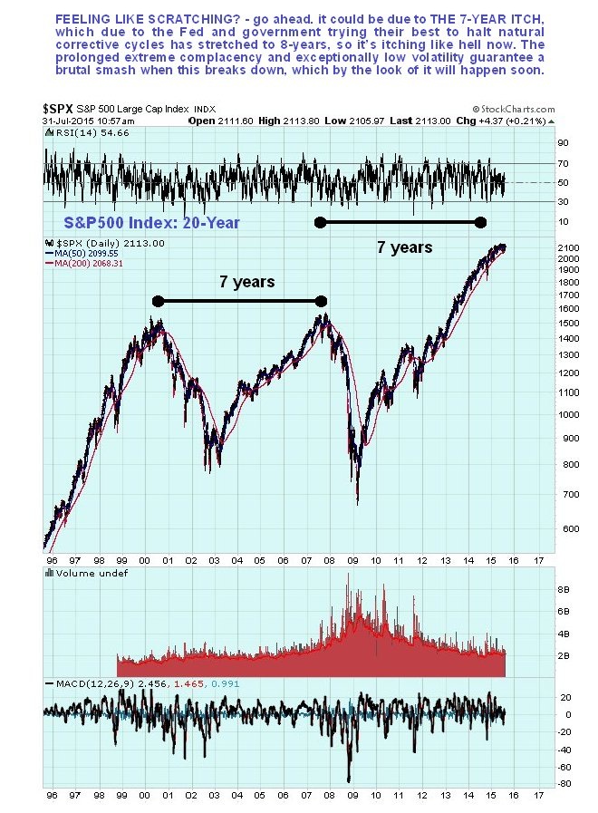
It’s time to move on to consider a range of charts for the flagship S&P500 index. We are going to zoom in progressively, starting with the long-term 20-year chart.
On the 20-year chart we can see that, purely on a cyclical basis, we are overdue for a bear market after a 6-year bull market with no significant correction since 2011. What is most bizarre about this bull market is that it hasn’t even been the result of an economic recovery. It is has driven by printing money, misallocation of capital fueled, by ZIRP and on company share buybacks, which in terms of genuine progress is about as effective as you climbing into a bucket and trying to lift yourself up by the handle. When you factor in inflation, this market hasn’t even made a new high – hasn’t got above its 2000 top.
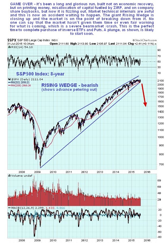
Next we consider the 8-year chart, on which we see that the bull market from early 2009 has taken the form of giant bearish Rising Wedge with volume steadily dwindling, which is bearish. With this Wedge having closed up and the market advance fizzling out, it is on the point of breaking down from it, and when it does the abrupt change in psychology will result in a devastating plunge, with the first two charts above suggesting that it will quickly become an absolute bloodbath. Bear ETFs will soar in price, especially the leveraged ones, and Puts will skyrocket.
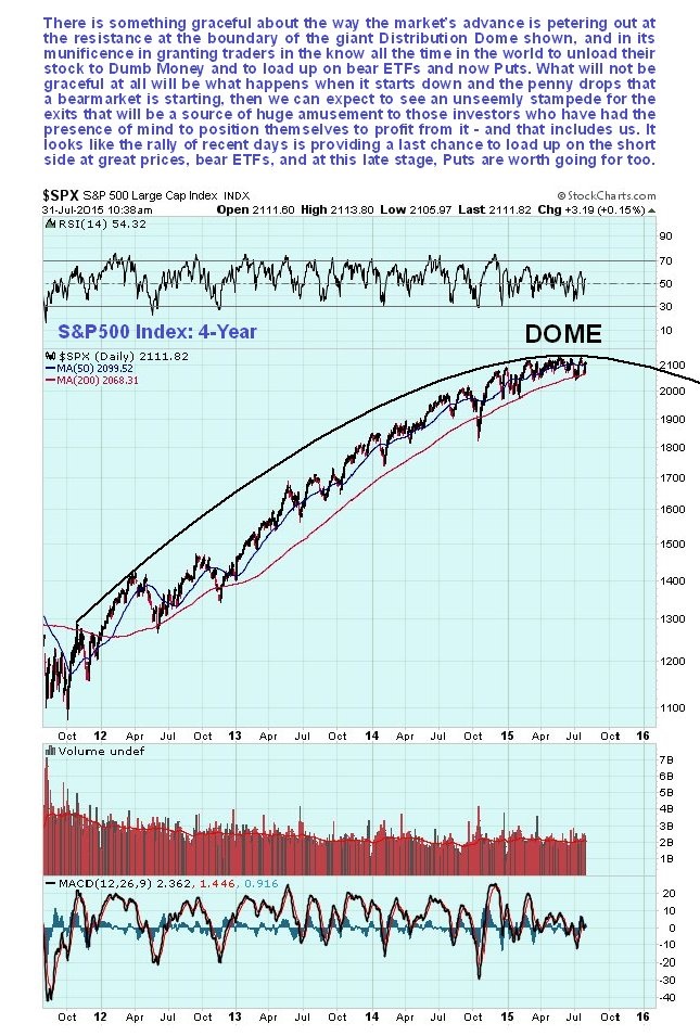
On the 4-year chart, within the Rising Wedge shown on the 8-year chart, we see that all of the advance from late 2011 has occurred beneath the confines of a giant Distribution Dome, and the geometry of this Dome explains precisely why the advance has ground gradually to a halt this year, as it comes up against resistance at the top of the Dome. Unless it breaks out of the top of the Dome, which looks highly unlikely given the charts that we have already reviewed above for Margin Debt and NYSE Available Cash, not to mention the terrible breadth of the market now and declining Advance – Decline line etc, then the Dome must now force the market lower – and into quickly breaking down from the Wedge shown on the 8-year chart, with the dire consequences already outlined.
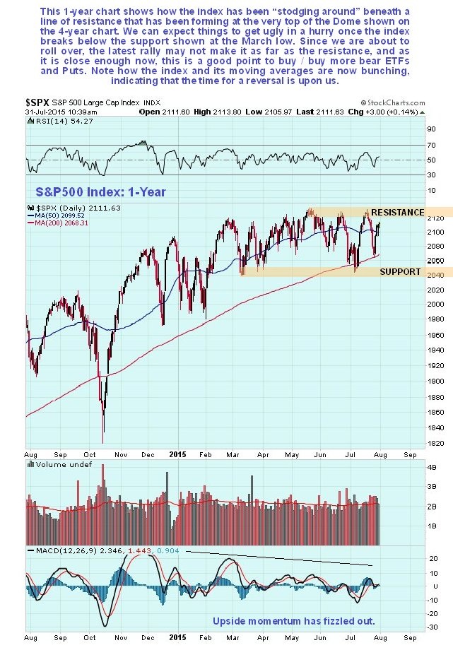
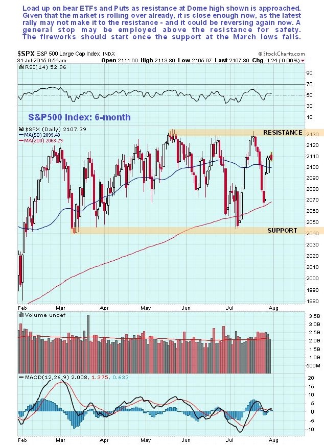
Zooming in closer still on the 1-year chart, we can see how the market’s advance has completely ground to a halt this year, with a horizontal resistance level at the top of the Dome now capping advances to the highs. A dangerous diminution of upside momentum is shown by the weakening MACD indicator at the bottom of the chart, and the current “bunching” of the index and its principal moving averages is what typically precedes a major change of trend. Once the support at the March low fails, which is at about 2040, things are likely to get ugly in a hurry – this is a key level to watch.
Finally, we look at the 6-month chart on which we can see recent action in detail. This chart helps us to time further purchases of bear ETFs, and options, which are becoming steadily more attractive. We can see that we have had another weak rally from the 200-day moving average in recent days, following the Fed meeting, and as it approaches the resistance at the highs, the prices of bear ETFs and Puts of course improve. So this is the time to buy them. Note, however, with the Dome now starting to descend, the index may not make it as far as previous highs, so it is considered appropriate to buy before it gets there and with it looking like it is stalling out as this is written, now looks like a very good time.
Inverse ETFs based on the major market indices are a very good play here, because the major market indices are the façade of the market, which to many still looks OK, but beneath this façade the run rots deep, with the market’s Advance-Decline line in a negative trend and many stocks already below their 200-day moving averages. The market is very like one of those shiny red apples which has been left too long in the fruit basket – looks great on the outside but when you bite into it you make the distasteful discovery that it is brown right through and has been rotting from the inside out. THAT is the state of affairs that exists now, and it is precisely because these bear ETFs are based on the major indices, which are the shiny façade of the market, that they represent such great value now – once the façade comes crashing down these ETFs are going to soar, especially the leveraged ones. The sequel to this update is the article PREPARING FOR THE CRASH – Bear ETFs Shortlist, including leveraged ones, now up on www.clivemaund.com and we will soon be looking at a range of Put options for the crash on the site.
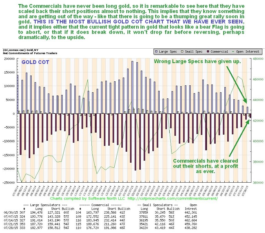
Perhaps rather strangely, gold could soar on this market crash, in contrast to what happened in 2008. Certainly this is what is implied by its latest COT chart shown below, which is the most bullish I have ever seen. The Commercials, who have never been long gold, have scaled back their shorts almost to 0, so they are clearly getting ready for something. What this implies is that, unlike in 2008, the dollar is going to drop with the stock market, which further implies that the flows of funds into the US will decelerate.
Related Research
Becoming Battered Billionaires
The Mother Of All Bubbles Will Burst In Late 2015
How Much Will The DOW Index Correct In The Developing 2015-2016 Bear Market?
********
Courtesy of http://www.clivemaund.com
share
share
share
share
share

Clive P. Maund’s interest in markets started when, as an aimless youth searching for direction in his mid-20’s, he inherited some money. Unfortunately it was not enough to live a utopian lifestyle as a playboy or retire very young. Therefore on the advice of his brother, he bought a load of British Petroleum stock, which promptly went up 20% in the space of a few weeks. Clive sold them at the top…which really fired his imagination. The prospect of being able to buy securities and sell them later at a higher price, and make money for doing little or no work was most attractive – and so the quest began, especially as he had been further stoked up by watching from the sidelines with a mixture of fascination and envy as fortunes were made in the roaring gold and silver bull market of the late 70’s.
Clive furthered his education in Technical Analysis or charting by ordering various good books from the US and by applying what he learned at work on an everyday basis. He also obtained the UK Society of Technical Analysts’ Diploma.
The years following 2005 saw the boom phase of the Gold and Silver bull market, until they peaked in late 2011. While there is ongoing debate about whether that was the final high, it is not believed to be because of the continuing global debasement of fiat currency. The bear market since 2011 is viewed as being very similar to the 2-year reaction in the mid-70’s, which was preceded by a powerful advance and was followed by a gigantic parabolic price ramp. Moreover, Precious Metals should come back into their own when the various asset bubbles elsewhere burst, which looks set to happen anytime soon.
Visit Clive at his website: CliveMaund.com