An Honest Look At Gold Price Charts


For the last two weeks, since the US elections, we’ve been discussing the possibility of strong inflection points building out on many different areas of the markets. These are areas where the markets can turn on a dime leaving those folks looking one way while the markets go the opposite way. Important inflection points are more of a price thing than a time thing. An inflection point can last days or weeks before they finally resolve themselves.
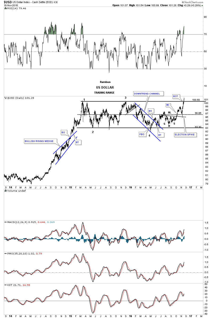
Let’s start by looking at the US dollar, as it plays such a key role in so many markets. Below is a three year daily chart which shows its major impulse leg up out of the mid 2014 low, and topped out in the spring of 2015. For just under two years the US dollar has been chopping out a sideways trading range, rectangle consolidation pattern, and closed above the top rail this week. The breakout is not actually confirmed yet as the price action would have to close above the 103 area and then a backtest to the top rail around 100 would have to hold. For the time being, we have to give the benefit of a doubt, to the US dollar bulls until proven otherwise.
There is one thing I would like you to show you before we move on and that is the backtest to the neckline, which occurred during the US elections. That sharp reversal off the neckline needs to be respected, as that spike shows up in other areas of the markets.
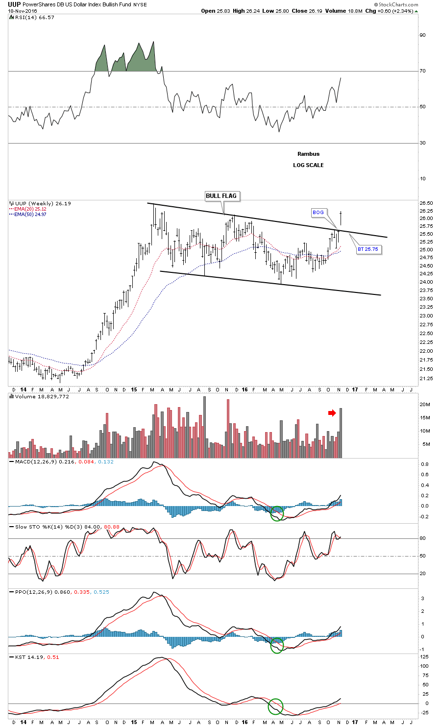
I’m going to skip over the longer term charts for the $USD, as we have been following them pretty closely. There are two other proxy’s for the $USD I would like to show you which may be giving us some confirmation the breakout may be the real thing. Below is a weekly chart for the UUP, which shows its sideways trading range as a bull flag. Note the big breakout gap that occurred last week on heavy volume. A backtest to the top rail would come in around the 25.75 area, which should be expected but not required.
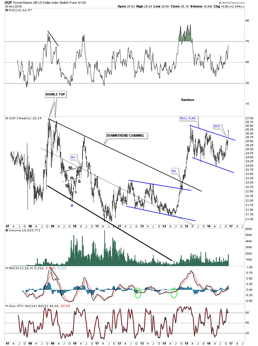
This next chart for the UUP is a longer term weekly look, which puts the bull flag in perspective. Again, if the UUP is truly breaking out in its next impulse leg up then we should see the backtest hold support at the top rail at 25.75. We have a very clean line in the sand, above the top rail is bullish and below is bearish.
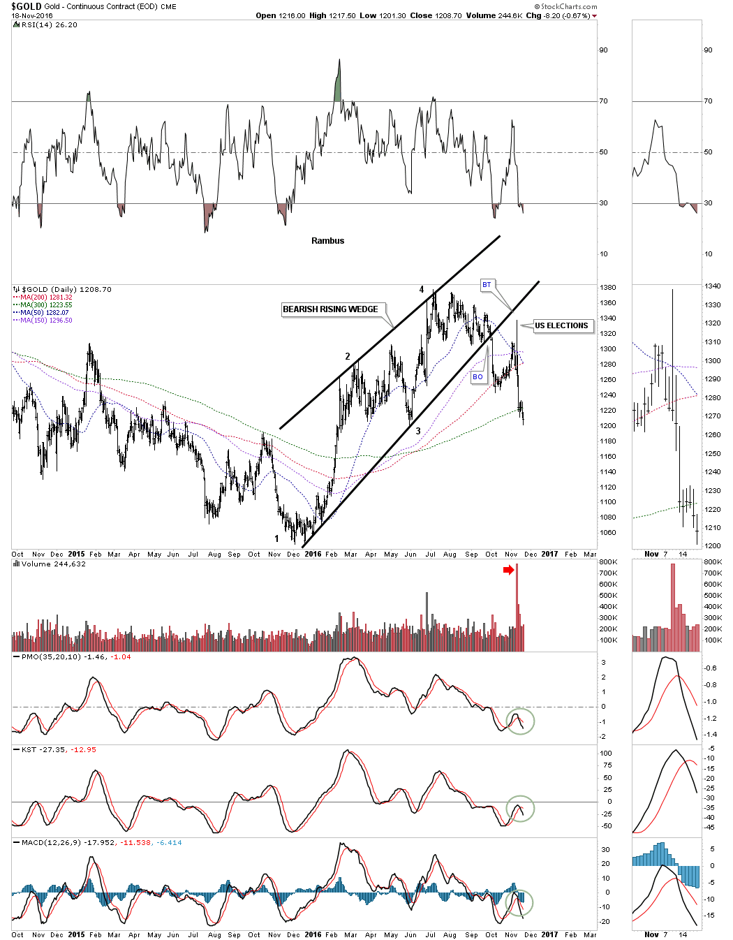
I’m going to start putting the pieces of the puzzle together by looking at this next weekly chart for gold which begins to show you a potential bearish setup taking place if the 1185 area fails to hold support. Note the top rail of the bear market downtrend line that began to form in September of 2011. What makes that top rail so compelling is the way the price action interacted with it, just before and right after the US elections. I’ve shown you on the daily combo chart for the PM complex the possible H&S tops that may be forming. I don’t show it on this chart, but the potential H&S top would be forming just below the top rail of the downtrend line, which is another reversal pattern forming at a most critical place. Some of you may be starting to see a potentially very large pattern developing, which I don’t believe anyone else sees yet.
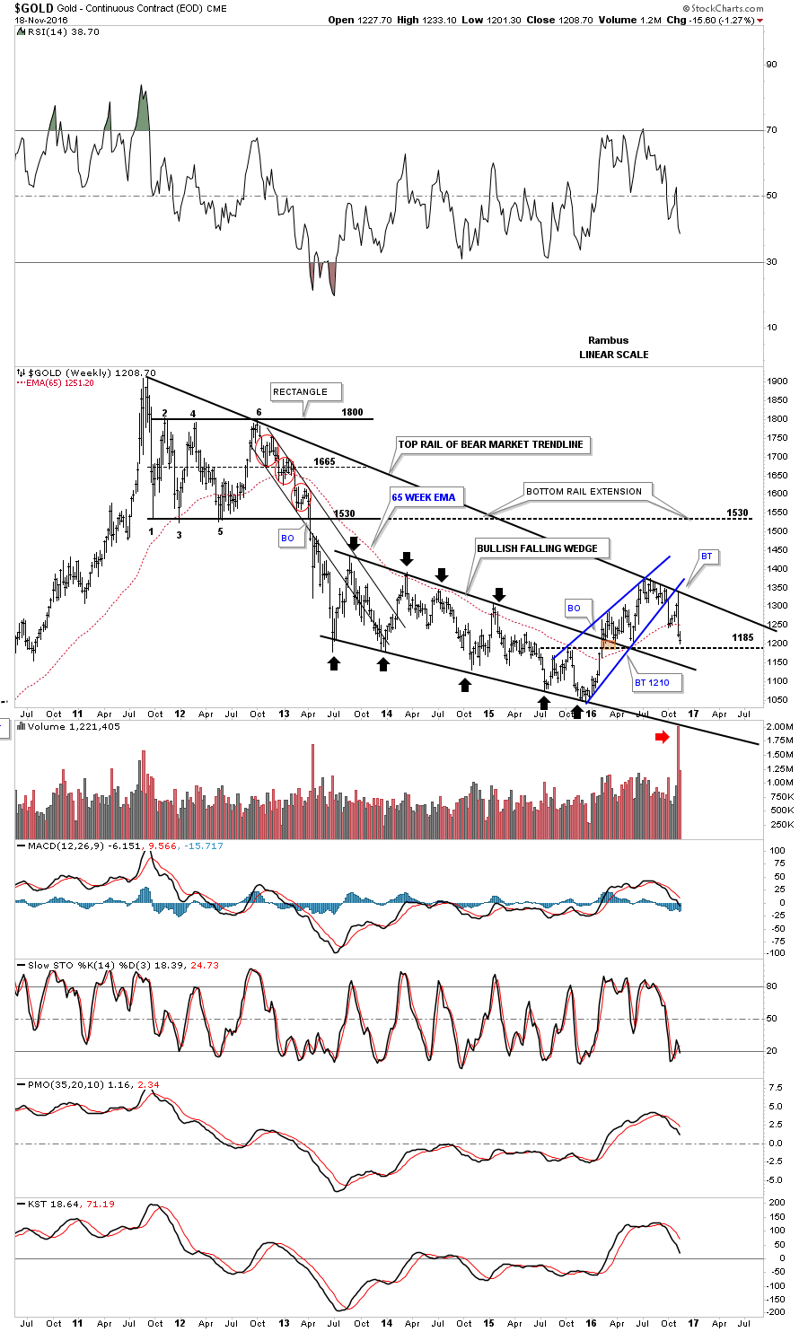
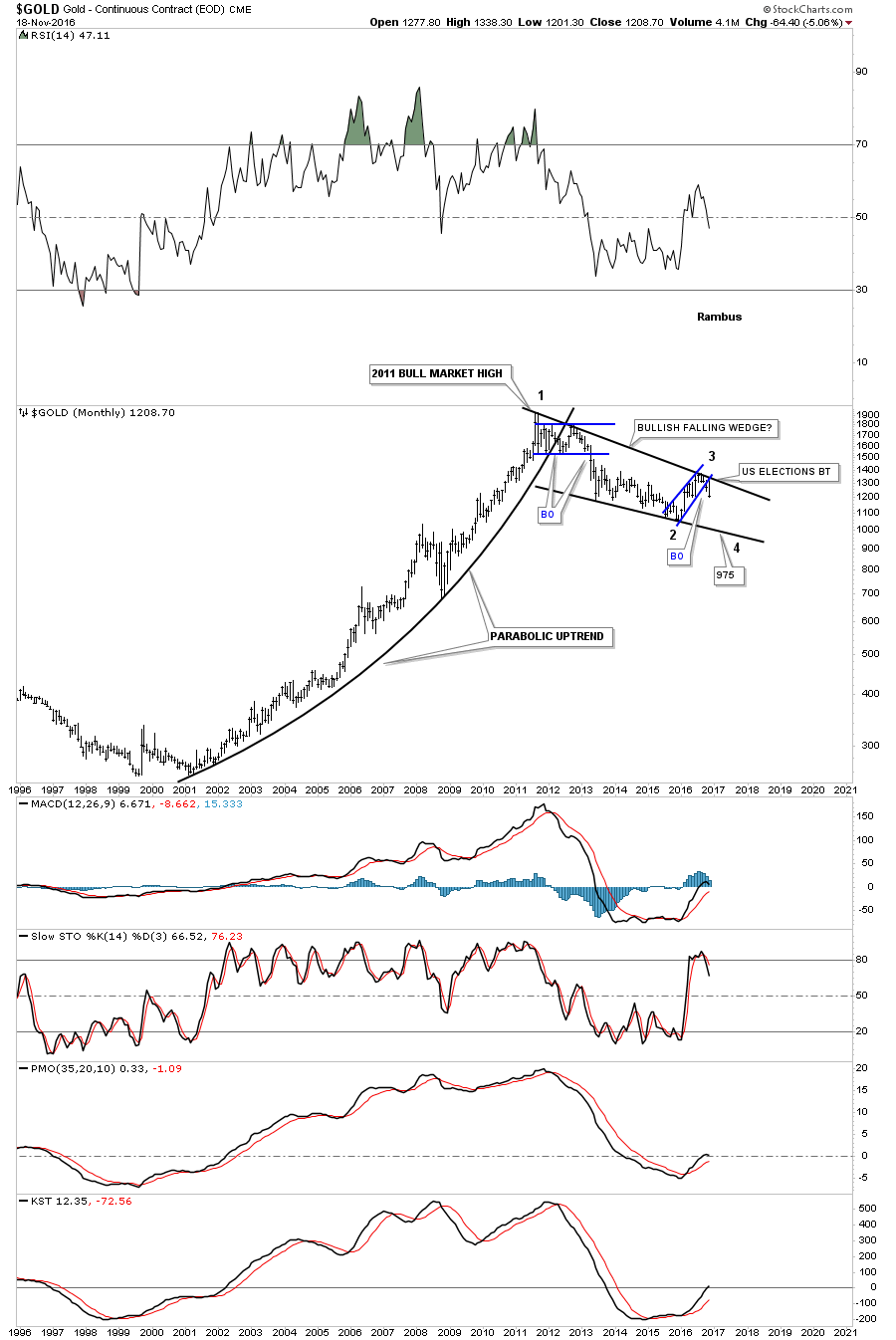
We are now at the point where we have to be honest with ourselves and put away all our preconceived notions of what we believe is really taking place in the PM complex. As they say, “honesty is the best policy.” Believe me I don’t like this next chart any more than anyone else but the potential is there for one more move lower in gold”s bear market. When you look at the Chartology of the black falling wedge it begins to make some sense. A move to the bottom rail would come in around 975 which would create panic in the bull camp, and euphoria in the bear camp. It would also complete the all-important fourth reversal point which is needed to create a consolidation pattern. Gold will still be in a bull market with a slightly different consolidation pattern. Note the price action at reversal point #3 with the hit at the top rail, and the breakout below the bottom rail of the blue rising wedge we looked at earlier. The inflection point is the backtest to the blue rising wedge that was made on election night.
I have many more charts I could post to make a case for caution ahead in the PM complex. It’s not what I want that matters, it’s what the PM complex wants that matters. There is no doubt that the price action since the August highs in the PM complex has stumped most trading disciplines. Sometimes the markets are tough to trade but having a game plan to follow is critical in understanding what to do, right or wrong. Up until two weeks ago the PM complex looked like it was ready to move higher right after the elections, but the price action has shown us a potential different scenario, which we need to heed.
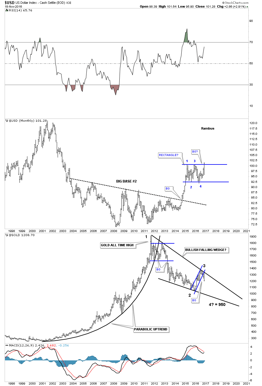
This last chart for tonight is a combo chart which puts everything in perspective. On top is the USD and on the bottom is GOLD. I’m not going to argue with what this combo chart is strongly suggesting, which is that the US dollar is breaking out from a big rectangle consolidation pattern, and gold is breaking down from the top rail of a, what we can still call, a bullish falling wedge. I know this Weekend Report isn’t what everyone wants to see but it’s an honest opinion of what may take place over the coming weeks.
 Meet Rambus, a seasoned trader and technical analyst renowned for his unbiased and insightful chart work. Through his website, Rambus Chartology, and Substack newsletter, Rambus shares his expertise with a global community of subscribers, providing daily updates, commentaries, and hands-on training in the art and science of chartology. With his calm, humble, and down-to-earth approach, Rambus demystifies complex market trends, helping his followers navigate the challenges of today's volatile markets. Join the Rambus Chartology community today and discover a unique blend of technical analysis, trading expertise, and time-tested protocols. Subscribe now at www.rambus1.com or https://rambuschartology.substack.com/


